20+ Donation Form Best Practices for Nonprofits (& Examples)
Is your nonprofit’s donation form optimized to drive donations? Use this guide to explore best practices to ensure your donation page is the best it can be.
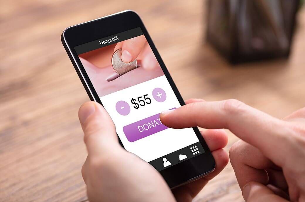
The growth of virtual nonprofit fundraising has been undeniable in the past few years. Pandemic restrictions, coupled with the rise of online fundraising software, have led more and more nonprofits to explore their options for digital fundraising opportunities.
When it comes to assessing the popularity of online giving among donors, the statistics speak for themselves. Online gift revenue grew by 19% over the past year. Plus, about 39% of donors who donated online to a nonprofit in a given year made a repeat gift online to that same nonprofit the next year.
What does this mean for your nonprofit? If your organization doesn’t have a streamlined way to collect online donations, you could be missing out on a major recurring revenue boost.
This guide to nonprofit donation forms offers more than 20 tips for building an effective online donation form that drives conversions and secures more financial support for your organization. We’ll cover:
Your organization’s donation form is the foundation of your online fundraising efforts. As such, it should be optimized for driving donations, with a streamlined user experience and intuitive design. Let’s take a look at the basics of donation forms and how you can use yours to grow support for your cause.

What is a Donation Form?
A donation form is a digital tool that allows nonprofits and other fundraising organizations like schools and churches to accept donations online 24/7.
It provides a convenient way for donors to fill in their contact and payment information using a secure payment processor that keeps their information safe.
When your organization has a well-designed donation form, you can gain access to benefits for both your nonprofit’s team and its donors. Your donation form:
- Gives donors a way to give anytime and anywhere. When your supporters feel inspired to give, you should offer them a way to contribute no matter where they are, what time of day it is, or what device they’re using. This ensures that you can take advantage of charitable sentiments immediately. An online donation form facilitates this instantaneous giving.
- Allows you to enhance your nonprofit’s branding. When you brand your giving form with your nonprofit’s logo and color palette, you associate your giving process with professionalism and unity. Donors will feel assured that their gifts are going to the right place.
- Helps expand your audience. Online donation forms are easily shareable since all you need to do is copy and paste the link. You can incorporate your giving page into your social media posts, email newsletters, and website blog posts.
- Provides access to donor data. When your organization uses a robust online fundraising platform to build your donation page, you can track donor data as supporters complete their online donation pages. This data includes information about your average donation amount and the highest volume donation day of the week. You can use this data to enhance future fundraising efforts.
Your donation page can play a major role in all of your online fundraising efforts, from your peer-to-peer campaigns to your text-to-give initiatives. However, you must ensure that your form is optimized from every angle to help you see the best fundraising results. Read on to explore how you can implement design best practices to ensure your donation page is as effective as possible.

Donation Form Best Practices for Your Nonprofit
These tips cover a wide range of donation form aspects, from the technology you use to build the form to how you construct the journey donors take while filling out the form.
1. Use a quality online fundraising platform to build your donation form.
First, you must choose the right digital fundraising platform to create your online donation form. If you don’t have a web designer on staff, be sure to find a platform that’s user-friendly, even for beginners.
Your online fundraising platform should offer features like:
- The ability to easily create well-designed donation pages with multiple template options. Platforms like Donately offer customizable donation form templates that are built to drive donations. Your donation form should be simple yet elegant to give donors a positive, intuitive experience.
- Integrations with other popular software options. Integrations allow your team to transfer data from your online giving form to other platforms like your constituent relationship management (CRM) system and email marketing platform. This makes it easy to keep new contacts in the loop post-donation and reach out with future appeals.
- Additional fundraising functionality such as peer-to-peer (P2P) fundraising and text-to-give. Your online fundraising platform should also offer functionality for launching unique fundraising initiatives that further engage participants virtually. With P2P fundraising, you can empower supporters to fundraise on behalf of your nonprofit. With text fundraising, you can provide a convenient mobile fundraising avenue. When these platforms are integrated with your online donation page, you can easily access donor data and track trends from each campaign.
Thoroughly explore your online donation tool options to find the right platform for your organization. For example, Donately offers online fundraising tools for nonprofits, churches, and other fundraising organizations. With Donately, you can centralize your digital fundraising efforts and analyze your progress using an intuitive, mobile-responsive dashboard.
If you’re interested, contact us today or sign up for a free account to see how you can revolutionize your organization’s online fundraising experience.
2. Embed your donation page into your website.
When supporters visit your website, your online donation page should be immediately accessible. You don’t want to deter any visitors from giving because your donation form is hidden or takes several clicks to find.
The best nonprofit websites feature embedded giving forms that allow donors to contribute without having to visit a third-party giving platform. This not only makes giving easy and convenient, but it also reassures donors that their payment information will be protected. Research shows that almost 90% of donors prefer giving directly within a nonprofit website rather than being sent to a third-party site.
After embedding your form into your website, place prominent buttons and links to the donation page on your homepage, website menu, about page, and other relevant pages. Making your donation button stand out on your website can actually result in a 190% increase in donations.
3. Simplify your donation form.
Just because a supporter clicks on your donation form doesn’t mean you’ve secured their donation just yet. If your donation form is too long or confusing, you risk pushing away potential donors.
To capitalize on supporter engagement, keep things simple as you design your donation form. Streamline your form by:
- Only asking for necessary details, such as donors’ names and payment information.
- Minimizing the number of images or distracting design elements.
- Eliminating your website’s navigation bar on your giving page to keep supporters focused on the donation form.
When it comes to donation page design and form fields, always take a “less is more” approach. Although it might be tempting to ask donors about how they found your organization and why they chose to give, you could inadvertently turn donors away if you ask too many questions.
4. Use A/B testing to help make decisions.
A/B testing is the process of creating two different versions of your online giving form and assessing which version is more effective for driving donations. When conducting A/B testing, try changing the following elements to determine which is more popular among audience members:
- Images. Test different types of photos for your banner image, such as a photo of a team of volunteers working or an individual within the community you serve.
- Tagline. Let’s say you’re raising money to support a climate change and conservation initiative. Try different taglines for your giving page. For instance, you might create one version that says “Join the Fight to Save Our Planet” and another that says “Join the Fight to Save Endangered Species.”
- Color scheme. Your organization probably has several colors in its palette that you use in your logo and marketing materials. Play around with different combinations to find the one that’s most pleasing to your donors.
- Suggested giving amounts. When you offer suggested giving amounts, you give donors an idea of the type of gifts you’re looking for. However, it can be hard to know what giving amounts you should include in your form. Test a variety of amounts to see which ones donors are most responsive to.
Conduct your A/B tests by sending different versions of your giving page to different groups. For instance, you might send one version to half your email audience and another version to the other half. Remember to only change one element at a time to gain an accurate picture of which changes are the most impactful.
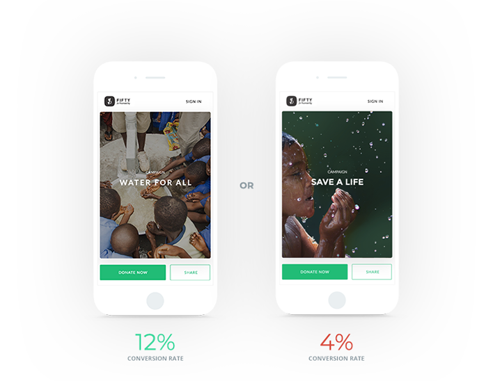
Check out this example of how a simple change to the tagline and photo made a big difference for this campaign:
5. Reduce the load speed of your donation form.
The recommended load speed for websites is about two seconds. If your online donation form takes longer than two seconds to load, you start losing visitors at a rapid pace. Over half of visitors will leave your site if it takes more than three seconds to load.
Therefore, it’s critical that you reduce your website’s load speed as much as possible. You can do this by:
- Compressing and optimizing images
- Optimizing your website code by removing unnecessary characters
- Caching your donation form page (and all website pages)
- Minimizing the number of videos, GIFs, and complex elements
These actions help reduce your donation page’s bounce rate, which is the number of visitors who exit your website after only viewing one page. By reducing your donation form’s load speed, you ensure that your visitors won’t abandon the page out of frustration.
6. Make your “submit” button unique.
When donors reach the end of your donation form, they might expect to find a simple “submit” button that lets them know they should click there to finalize their contribution. Putting “submit” at the end of your giving page is totally acceptable, but you can also use the button as a final way to remind donors why they’re filling out the form in the first place.
Instead of “submit,” consider adjusting the button to say “Give Now,” “Donate Now,” or “Make a Donation.” This keeps donors in a charitable mindset and helps them feel a greater sense of pride in their good deeds.
7. Collect and assess donor data using your donation form.
When you use a robust online fundraising platform to build your donation page, you can gain access to a comprehensive dashboard of donor data and insights. You’ll be able to identify trends such as:
- Who your most active donors are
- What the most popular day of the week and time of day is for donations
- Popular and average donation amounts
- The effectiveness of certain campaigns, such as your text-to-give initiative
Once you’ve identified these trends, you can incorporate your findings into future fundraising campaigns. For example, you might discover your most popular day of the week for donations is Wednesdays. For an upcoming campaign, you can focus your social media posting schedule around Wednesdays as your big day for outreach.
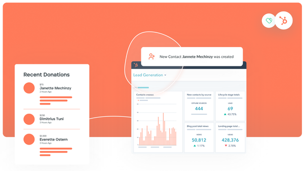
Here's an example of what your donor dashboard might look like:
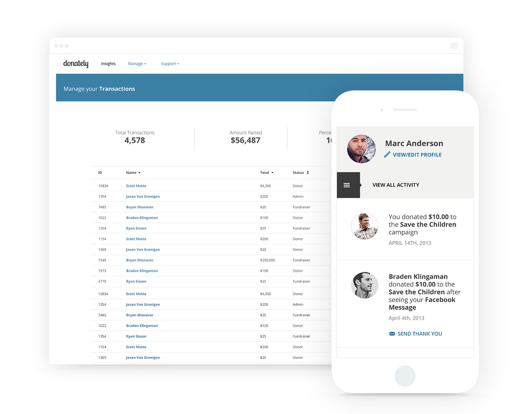
Having all this data centralized into a convenient dashboard gives you insightful information to share with your fundraising and marketing teams to help them create data-driven campaigns.
8. Use compelling images.
You don’t have much room for long paragraphs of text on your donation form, but luckily, a picture’s worth a thousand words. Your donation form should feature one or two compelling images that showcase the people you serve and the impact of your work.
If your organization is an animal shelter, use a photo of a family adopting a dog or a volunteer cuddling a cat. If your organization offers youth summer camps, choose a photo of kids participating in your camp’s activities such as archery or horseback riding. When you give a human face to your cause, you can spark an emotional response in your audience members.
Be sure to use original images, not stock photos. Most of your audience will be digitally savvy enough to spot the difference between a real image and a posed or purchased one.
Remember, you can use A/B testing to determine which images are most effective for driving engagement and donations among your audience members.
9. Use emotion to tell your nonprofit’s story.
As mentioned, when your website visitors reach your online giving form, not all of them will be all-in on donating just yet. You may have audience members who are still on the fence about contributing some of their hard-earned dollars to your cause.
That’s why it’s important to offer these individuals a compelling reason to give right on the donation form itself. Don’t ramble on in a full-page essay, but use a paragraph or two to succinctly explain to your audience the purpose of your fundraising efforts and how donations make a real difference for the people you serve.
Use your form description to explain:
- Your organization’s mission
- The audience you serve
- The purpose of your fundraising efforts
Brush up on nonprofit storytelling best practices to help you craft the best description possible for your fundraising page. If you feel stuck, revisit the basics of storytelling — ensure your story involves a character or characters (perhaps your nonprofit’s constituents or volunteers), introduces a central conflict, and offers a solution for resolving that conflict. Emphasize the crucial role that donors play in achieving your goal.
10. Describe how you’ll use donors’ contributions.
According to Bloomerang's donor retention guide, 8% of donors stop giving to nonprofits because they have no idea how the organization used their contributions. Using your donation form to tell donors how you’ll use their donations is a simple, but highly effective addition you can make to your online page.
Whether you’re seeking donations to fund your mission in general or a specific major project, let your donors know where their money is going. For instance, you might explain how financial support helps fund your mission to create backpacks full of supplies for people experiencing homelessness. Or, you might discuss how donations will go toward funding your organization’s current project of expanding your physical facility.
Either way, it’s important to be specific and accurate in your description of what you’ll do with donations. In addition, follow up with donors after they contribute to keep them updated on your progress and show them that you’re true to your word. This builds donors’ trust in your organization and encourages them to continue giving to your cause.
11. Highlight matching gift options.
In matching gift programs, companies match donations that their employees make to eligible nonprofits. Most companies match at a 1:1 ratio, but some will match at a 2:1, 3:1, or even 4:1 ratio.
This represents a potentially major funding boost for your organization. However, according to 360MatchPro's matching gift statistics, between $4-7 billion in matching gift funds goes unclaimed every year. This is due to a combination of poor awareness among donors and a lack of time and resources among nonprofits to pursue matching gift revenue.
Luckily, you can use your online donation form to raise awareness of matching gifts and identify eligible donors directly through the donation process.
Donately offers an integration with Double the Donation, the leading provider of matching gift software. Double the Donation offers the world’s largest matching gift database, representing more than 26 million match-eligible employees. This integration allows nonprofits to identify match-eligible donors and use automated, customizable outreach to encourage donors to get their gifts matched.
Use your giving form, confirmation page, or your follow-up thank-you emails to encourage donors to fill out the necessary forms to get their gifts matched. Emphasize how matching gifts can make an incredible difference for your fundraising efforts.
12. Promote recurring donations.
One-time donations are obviously helpful for supporting your organization’s fundraising efforts — after all, every bit helps. But recurring donations provide your organization with reliable, steady support, helping you weather any rough patches or funding downturns.
Use your donation form to promote your recurring giving options, such as your monthly giving program. Provide an option for donors to turn their one-time gift into a recurring donation right within your giving page.
Plus, with a powerful platform like Donately, donors can make changes to their recurring giving plans themselves within a donor dashboard. They can update credit card information or change the date that they want their recurring giving plan to expire. This feature offers greater convenience for donors and for your staff members.
With Donately, you can also follow up with donors whenever donations fail to go through. You can work quickly to address any errors to ensure donations continue flowing smoothly.
13. Offer suggested donation amounts.
Some donors fill out your donation form with a clear idea of how much they want to contribute. But others are more uncertain about how much they want to give. You can offer these supporters greater guidance by including suggested donation amounts on your giving form.
Suggested donation amounts encourage donors to give in those exact amounts. They rely on the phenomenon of social proof. This is the idea that people will emulate the behavior of others when they are faced with an unknown situation.
When supporters see that you offer suggested giving amounts of $20, $50, and $100, they figure most other donors are giving in those amounts, so it’s reasonable for them to choose one of those numbers, too.
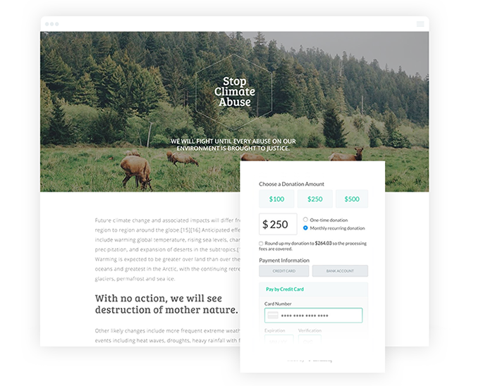
As you can see, this donation form offers suggested giving amounts of $25, $500, and $2,500 to appeal to different levels of donors:
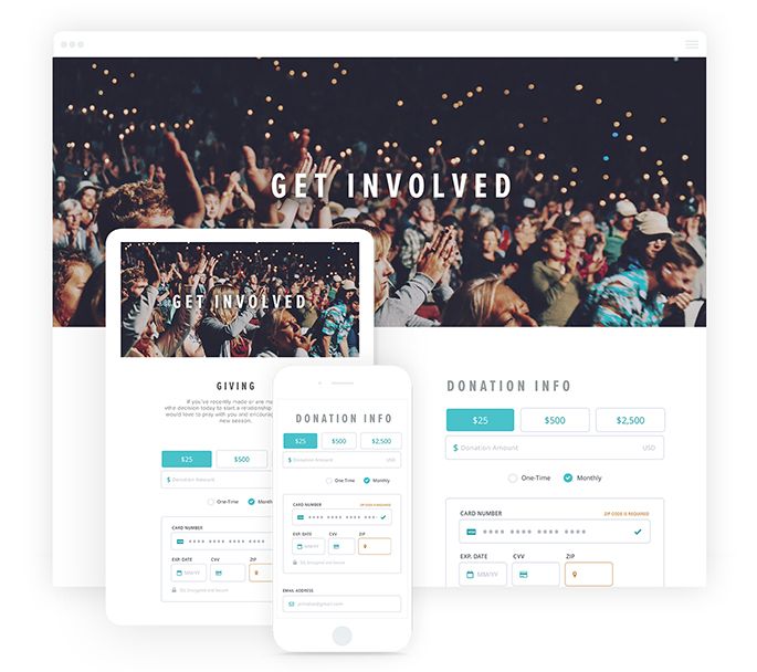
Be sure to set your giving amounts at a practical rate. Review your average donation amounts and donation ranges from previous fundraising initiatives to create suggested giving amounts that are acceptable to your audience members. You can use A/B testing to determine which giving amounts strike the right balance between being acceptable to donors and effective for your fundraising efforts.
14. Use secure payment processing tools.
When you encourage supporters to fill out your donation form, it’s a big ask. You’re not just asking for their support — you’re also asking for them to trust you with their sensitive payment information. That’s why you need a secure donation processor to reassure supporters and keep their financial information secure.
Look for a donation tool with a payment processor that is:
- PCI-compliant. This means it aligns with industry standards for keeping credit card information safe.
- Built with nonprofits in mind. This ensures that if you require customer support, your software provider is familiar with the donation processing requirements of nonprofits.
- Easy to set up. Your online donation platform should integrate seamlessly with leading payment processors like Stripe and Paypal.
You could just use a payment processing tool on its own. However, these platforms don’t offer nonprofit-specific features like the ability to create customizable donation pages, track donor information, and send automated and personalized thank-you messages.
Plus, all of these features contribute to the professionalism of your donation process, reassuring supporters even more that their decision to trust your organization was the right one.
15. Allow multiple payment options.
Not all donors will want to use the same payment method to contribute to your donation page. Offer a variety of payment options so donors can choose the method they prefer.
Make sure your online donation tool can accept the following payment methods:
- Credit card
- Debit card
- ACH direct deposit
- Stripe or PayPal
List out all the options on your donation form and encourage donors to choose their preferred method.
16. Ensure your donation form is mobile-friendly.
Last year, mobile users made up 33% of online transactions. That means that potentially 1/3 of your audience members will access your donation form using their mobile devices. If your giving page isn’t mobile-friendly, you could potentially alienate this large chunk of your supporters.
Turn your page into a mobile-friendly form by:
- Using a mobile-responsive template
- Ensuring your images load properly in the mobile view
- Using a large, easily readable font
- Eliminating pop up messages or ads
- Keeping your page design simple
We’ve all had the experience of clicking a link in a social media post or email and being sent to a website that’s practically illegible in the mobile view. You don’t want visitors to have that experience when viewing your donation page on their smartphones. By optimizing your donation form for mobile screens, you can capture the attention and engagement of the all-important mobile audience.
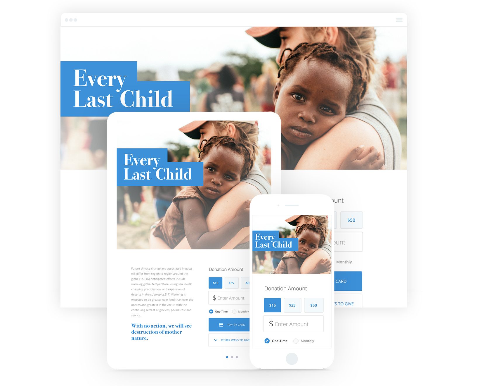
Check out this example of a mobile-responsive donation page that automatically adjusts to fit different screen sizes:
17. Make your donation page accessible to all visitors.
Web accessibility means that your website pages are accessible and usable for all supporters, no matter their abilities. Just like the rest of your website’s pages, your online donation form should be fully accessible to ensure everyone who wants to support your cause can do so.
As you design your form, keep these website accessibility best practices in mind:
- Use a clear page structure with heading tags and working jump links to assist those using screen readers.
- Include alt text with images.
- Ensure there’s sufficient contrast between your foreground text and background colors.
- Use a straightforward, simple visual design.
You can test the accessibility of your website using a free browser plugin tool, such as Google Chrome's Lighthouse. When you run an accessibility report, Lighthouse will provide a score and offer suggestions for improving different page elements to increase accessibility.
18. Brand your donation form using your organization’s colors and logo.
Your online donation form should be instantly recognizable to supporters as belonging to your nonprofit. Boost brand recognition by including your organization’s logo, color palette, and imagery on your online donation page.
Test out different variations of your logo or color combinations to find the right look and feel for your donation form. Your visual elements should work in harmony to provide a clean, professional experience for donors.
Make sure your brand choices are consistent throughout the entire form. For instance, if you choose one color combination, be sure to stick with it throughout each element of the page.
19. Promote your giving form using a variety of marketing channels.
Once your form is finalized and ready to go, it’s time to spread the word. An effective marketing plan includes a variety of communication channels and outreach strategies to connect with a wider audience.
Promote your donation page using your:
- Social media pages. Include the link to your giving form in your Facebook, Twitter, and LinkedIn posts. Be sure to also include the link in your bio or 'About Us' page.
- Email. Share your giving page link in your weekly or monthly newsletter.
- Website blog posts. Intersperse your blog posts with occasional links to your online giving page.
- Direct mail. Include a simplified link or QR code in your postcards and letters to direct recipients to your online giving form.
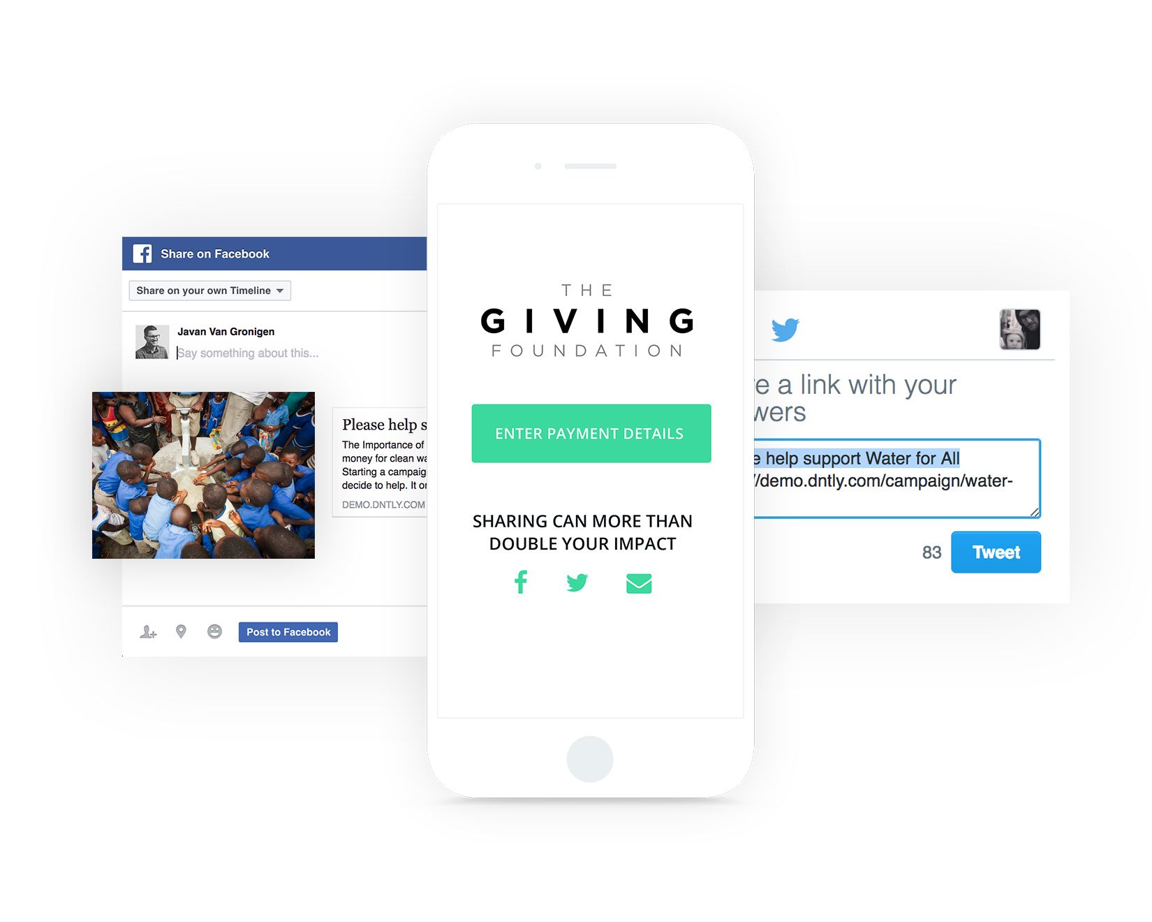
By taking a multichannel marketing approach, you can reach different segments of your audience on different platforms. Plus, you can reinforce your message through repeated exposure. This might help provide the extra push certain supporters need to take the leap and become donors.
20. Incorporate your donation form into your virtual fundraising initiatives.
Your mobile-optimized, streamlined, secure online giving page is a great asset you can use in any fundraising initiative. Incorporate your donation form into your:
- Text-to-give fundraisers: In a text-to-give fundraiser, your organization will partner with a text fundraising provider and receive a designated phone number and keyword. When supporters text your keyword to your phone number, they’ll receive a link to your online giving form.
- Peer-to-peer fundraising campaigns: With a peer-to-peer fundraiser, you can use your online giving page to offer participants an example that they can base their personal fundraising pages on.
- In-person or virtual events: Share the link or QR code to your online giving page throughout the duration of your event to encourage attendees to keep the fundraising going.
Unlike traditional fundraising methods such as direct mail, your online donation page can give your organization access to instant donations. It’s also easily shareable, making it a great addition to any fundraising initiative.
21. Follow up with donors.
13% of donors said the reason they didn’t give again to a nonprofit was that they never got thanked for their initial donation. Expressing gratitude to donors is critical to secure those beneficial repeat donations.
Right after donors submit their donations, reroute them to a confirmation page that thanks them for their contribution immediately. Your online donation tool should also allow you to send an automated receipt to each donor to keep for their records.
Lastly, you can use your donor data to follow up with each donor using a personalized thank-you letter or email. Make sure you include each donor’s preferred name and reference their specific donation amount. This shows donors that you’ve taken the time to learn about them as an individual, making the messages feel much more genuine.

Top Donation Form Examples
To get you thinking about how you might want to craft your own donation page, we’ve compiled a few top examples of well-designed forms.
1. United Way of Greater Los Angeles
United Way works to “break the cycle of poverty” for low-income families, veterans, students, and people experiencing homelessness. They provide services in three key areas: education, housing, and economic mobility.
Their online fundraising page discusses the effects of the COVID-19 pandemic on community members and explains how they will use donations to provide immediate pandemic relief.
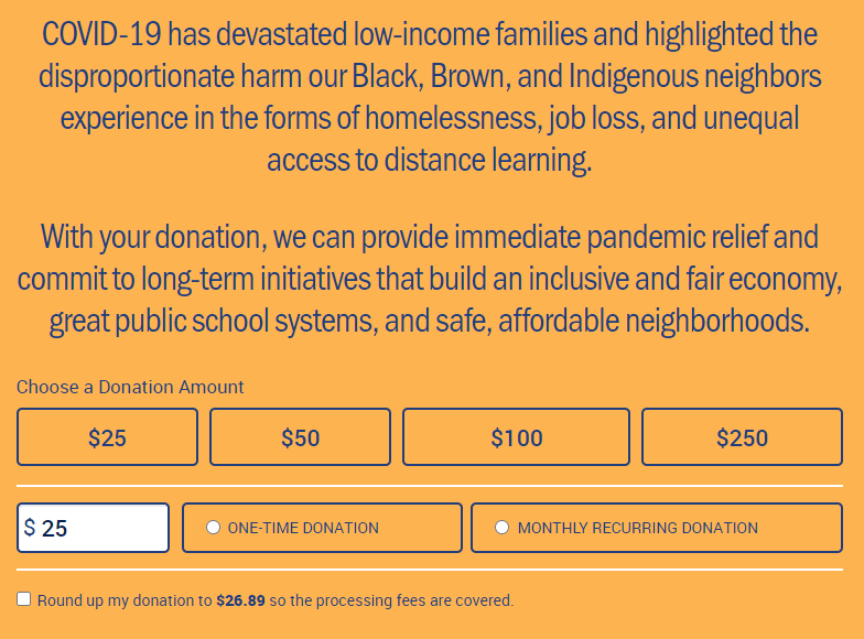
Right away, the form offers several suggested giving amounts as well as the option to type in a custom amount. Plus, supporters have an easy way to turn their one-time gift into a recurring donation. Then, the form expands further for supporters to fill in their contact and payment information.
2. Water.org
Water.org helps provide people with access to safe, clean water for drinking and sanitation. They do this by offering affordable financing solutions, such as small loans, to help households in need put a tap or toilet in their homes.
Their online giving form is simple, yet highly effective. The page features a large banner image at the top and a short fundraising message that encompass their mission.
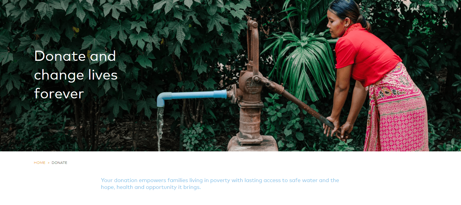
After scrolling down, donors simply choose their preferred donation amount, input their personal information, and can donate all in a couple of minutes.
3. The Barstool Fund
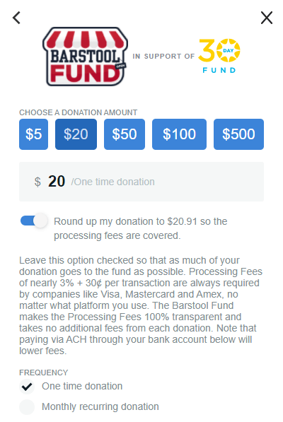
The Barstool Fund is a charitable initiative run by sports and pop culture media outlet Barstool Sports to support small businesses that have been impacted by the impacts of the COVID-19 pandemic.
Their site offers a great example of a pop-up donation form. The form features multiple giving options and even includes the ability to pay with cryptocurrency.
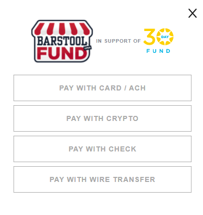
It also offers donors the option to round up donations to cover processing fees. This gives donors an opportunity to support an organization even further by ensuring everything they contribute actually goes to the mission.

Wrapping Up
As you can see, there are plenty of ways you can optimize your nonprofit’s online donation form to ensure it’s an effective fundraising tool. Any time you want to make a change to the form, be sure to do so in a way that improves the experience for donors and encourages them to revisit your form or become recurring supporters.
If you’re interested in learning more about how you can improve additional aspects of your online fundraising strategy, check out these additional resources:
- Virtual Fundraising: The Nonprofit’s Complete Guide for 2021. How does your online donation page fit into your overall online fundraising strategy? Find out how to enhance your virtual fundraisers with this complete guide.
- 18 Online Donation Tools to Help You Raise More in 2021. There are plenty of additional online donation tools available that can support your fundraising efforts and work in tandem with your donation form. Here are the top options.
- Nonprofit Donation Processing: The Essential Guide for 2021. To keep your donors’ personal information secure, you must understand how donation processing works. Review this article to learn the ins and outs of nonprofit donation processing.


