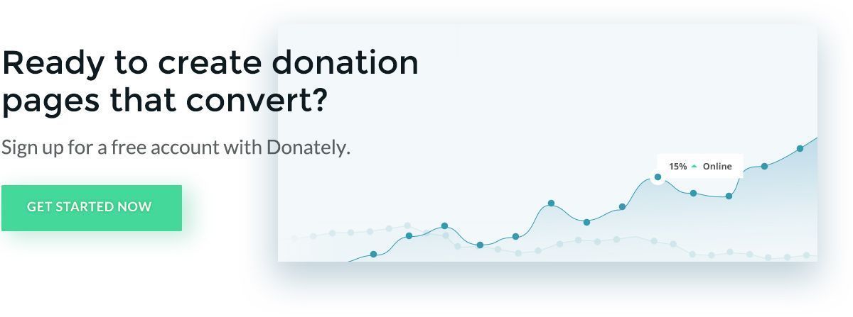
Donation Pages: The Complete Guide + 32 Tips and Examples
Get inspired by the best donation page examples on the web. Plus, learn more about what makes donation pages successful in our ultimate guide for nonprofits.

Your nonprofit’s donation page serves as the foundation of your online giving strategy. When a supporter decides to contribute to your cause, they'll head over to your donation page. But if they find it difficult to submit their information (or worse, if they can't find the page at all), they'll likely abandon their gift altogether.
In other words, your donation page can mean the difference between driving gifts and losing support during the final stage of the donation process.
Donation pages by Donately convert an average of 28% more donors overall. We’ve taken our expertise from designing these high-converting donation pages to develop actionable tips that your organization can use for more effective pages on your own site. In this guide, we’ll let you in on the secrets that have led countless nonprofits to raise more by building an effective digital toolkit.
We've broken our 30 expert donation page tips into the following categories:
- Intuitive Technology
- Effective Design
- Compelling Content
- Financial Options
- Proactive Marketing
- Accessibility
- Further Engagement
Your donation page represents your organization and should embody your mission. Explore these tips and examples to learn how to create the best possible donation page. Before we dive in, let’s make sure we’re on the same page about the basics starting with the definition of a donation page.
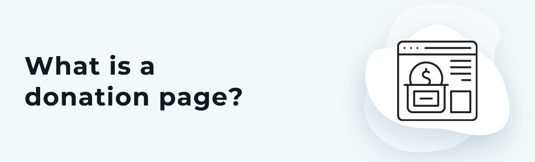
What is a donation page?
A donation page is a web page where supporters can donate directly to your organization. Many organizations use one centralized donation page for their general fund as well as several other donation pages to fund specific organization campaigns. Donors can simply enter their donation amount and payment information to complete a gift online!
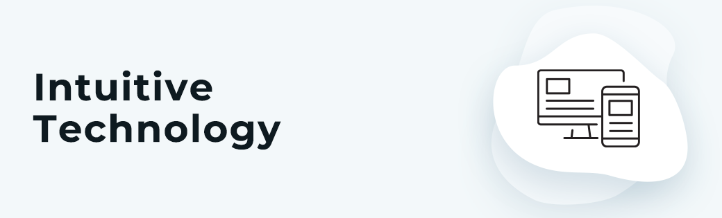
Intuitive Technology for Donation Pages
Your technology can make or break your fundraising plan. Let's take a look at a few tech-based best practices, starting with tips for selecting intuitive donation page tools. Then, we'll uncover how to make the most of these tools when designing your donation page.
1. Invest in dedicated donation page software.
Dedicated fundraising software will streamline the donation page creation process. With an effective donation page platform, you'll have access to the following tools and features for optimal online giving:
- Pre-filled suggested donation amounts to make giving incredibly simple
- Recurring gift options to create a steady stream of revenue
- Mobile-responsive pages so donors can contribute from any device, anytime, anywhere
- Data collection tools so you can analyze the effectiveness of your design and adjust accordingly
At the end of the day, your donation platform should simplify the giving process and help you secure more revenue. By prioritizing the above features, you'll wind up with an intuitive tool that is well-equipped to create a positive online donor experience.
We recommend checking out our intuitive tools to fill in any gaps and to maximize your online fundraising potential. At Donately, we offer fully-customizable and conversion-optimization donation forms that can be altered to bring your vision to life.
After working with more than 1,000 organizations and individuals, we understand what works and what doesn't when it comes to online fundraising. Sign up for a free account to see how our tools will work for your cause!
2. Embed your donation page into your nonprofit website.
Your donors should never have to leave your website when they want to contribute to your cause. Ensure your donation tools enable you to embed your form directly into your website.
From here, be sure to customize it to match the rest of your website and to fully convey your brand.
Follow any branding guidelines you have for your nonprofit so that the page fits seamlessly into your website. Use the same color scheme and typography on your donation page as you use throughout your website and communications. Be sure the message on your page matches the tone and voice as well.
Aligning your donation page with your existing branding establishes a sense of trust that the page is in fact from your organization. If prospects are directed to a third party page or if they don’t recognize the visuals of your donation page, they may believe they’ve run into a scam and likely won't trust it enough to submit their private information (like payment data).
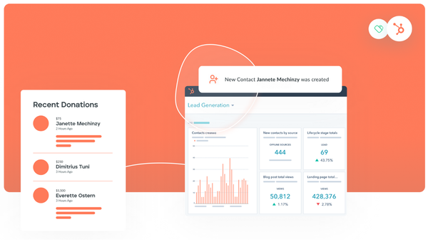
3. Collect donor data from your donation page.
Maximizing your donation page involves collecting insightful donor data. Data-driven fundraising allows you to determine improvement opportunities to grow your impact online in ways far beyond your original goals.
However, analyzing each donor's data one at a time isn't doable, especially as your donor base continues to grow. Instead, employ a dashboard on your fundraising software that offers a range of data, so you can determine:
- Who your most active donors are
- Popular donation amounts
- The effectiveness of individual fundraising or marketing campaigns
- Fundraising trends, such as high volume days of the week
Leveraging this data allows you to understand which donation page tactics are falling short. From here, you'll be able to refine your online fundraising strategies for future campaigns. For example, you can use this data to segment your donor base and reach out to them in more personalized ways, or you can determine the best times to request donations via email or social media.
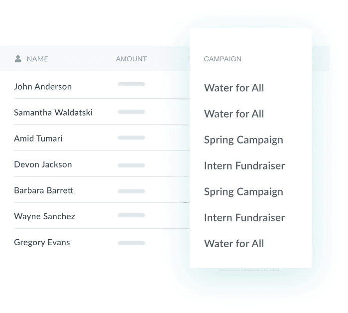
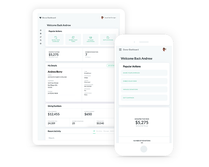
Effective donation page platforms will include built-in methods of collecting and organizing donor data. Take a look at this example from Donately’s CRM, which allows you to filter the data by campaign:
4. Use A/B testing to design your donation page.
A/B testing is a user experience research strategy that involves showing two variations of a web page to different sets of website visitors. The goal of this process is to determine which design better drives conversions or, in this case, donations.
Let's walk through specific options for testing and comparing different designs:
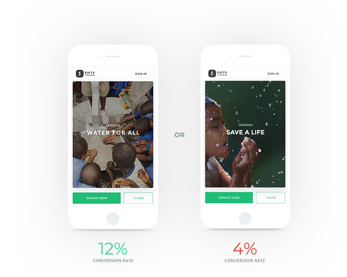
- Banner Image: Your banner image is one of the most prominent visual components on your donation form. Test a few options to determine which type of visual seems to resonate with visitors and drive more contributions.
- Headline Text: Your headline is likely what will stick with your visitors the most after they leave the page, and it's one of the first indicators of what the page is about. Determine what wording grabs users’ attention and encourages them to donate.
- Color Scheme: Use different combinations of your organization’s brand colors to test different buttons and header options. Use other pages on your website as a guide, then experiment until you find the perfect combination for your donation page.
- Suggested Giving Amounts: Donors often use preset giving amounts as a reference point when determining how much to give. See if increasing or decreasing the preset suggestions has any significant impact on the average donation amount.
Take a look at the difference in conversion rates caused by tweaking some of these elements:
Effective Donation Page Design
Your donation page design does more than make giving more visually appealing to visitors. In fact, it plays directly into your conversion rate by funneling your prospects through the giving process. Let's explore a handful of suggestions for creating a conversion-optimized donation page design.
5. Create an initial donation page outline.
Before actually creating your donation page, you should design a rough outline detailing what information you'd like to collect from supporters on the form. This way, you can use the outline to organize the fields intuitively.
For instance, you'll want to inquire about basic details first, such as donors' names and contact information. This allows your prospects to introduce themselves before diving into the nitty-gritty details, like payment processing information. Otherwise, you risk overwhelming them from the start, giving them the impression that your donation form will be difficult to complete.
We recommend using a straightforward structure. A clear structure will help both users and search engines navigate your page and access the most vital information: how to donate.
6. Use compelling graphics on your donation page.
It may be tempting to throw a generic stock image on your donation page just for the sake of having a photo there. However, doing so forfeits the opportunity to communicate your mission to visitors. Effective graphic design can make your page visually appealing and easier to consume.
Inspire prospects to follow through with images such as:
- Your nonprofit’s official logo.This will reinforce your brand and assure donors that they’re giving directly to your organization.
- A high-quality banner image. Choose a high-quality, inspiring photo that reinforces your mission and your donor’s intention to give. This might be an image of someone who benefits from donations or someone who volunteers or works at your organization.
- Images tied to donation amounts. Show the impact of different donation amounts by adding images to suggested giving amounts with short descriptions. For example, if a $50 donation provides hot showers and clean clothes for someone, you can include a picture of a running shower with a description like, “For $50, you can provide someone with hot showers and clean clothes for a week.”
You can also touch up other parts of your form with decorative graphics. Just remember, while images present a great opportunity to level up your page, simplicity is key. If your donation page is overloaded with too many graphics, that can actually work against you and distract prospective donors.
7. Brand your donation page to your nonprofit.
According to the most recent online giving statistics, branded donation pages bring in 6x more money than generic donation pages.
A branded donation page helps build a relationship between a nonprofit and its donors. When your donation page clearly reflects your brand, you’ll instill trust in your donors and create more brand awareness for your cause.
Follow these donation page best practices to brand and design your page:
- Make your branding consistent. Make your donation form consistent with other marketing and campaign materials. This way, no matter how individuals arrive at your donation page (through direct mail, social media, etc.), they will already be familiar with your branding and feel confident that they’re in the right place when they arrive on the page.
- Use your color scheme and logo. Use a color scheme and font that complements your brand (though no more than 2 or 3 colors). Also, be sure your logo is prominently displayed on your donation page, generally in the upper left-hand corner.
- Ensure a relevant and consistent voice. For effective branding, all content you create should have a similar tone that reflects your organization well. Make sure the messaging on your donation page and within your donation form aligns with the established voice of your brand.
- Use visuals. In order to capture a donor’s attention, use an image that will connect with them and reflect the purpose of your organization. For instance, an animal shelter may choose to feature a photo of one or two of their furry residents to resonate with visitors.
Branded donation pages can go a long way, so if you work to ensure consistent branding and to accurately reflect your organization, you’ll be more likely to have a higher donation page conversion rate. Instill trust in your donors so they feel confident that they know where their contribution is going.
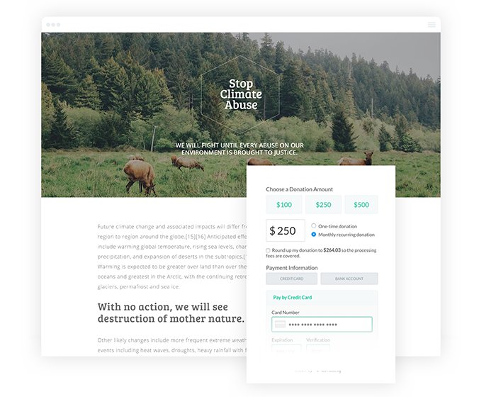
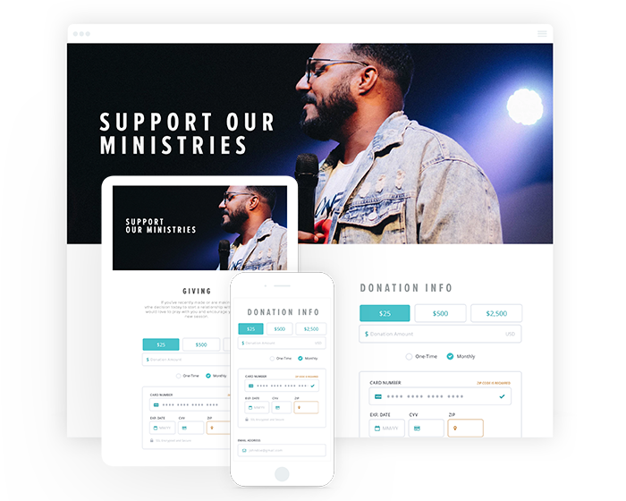
Take a look at this donation page example, which incorporates an eye-catching (and original) banner image as well as their cause's colors:
If you want guidance while revamping your branded donation page, consider working with a nonprofit marketing agency. These professionals can help you optimize your marketing materials to reflect your brand identity.
8. Simplify your donation form.
Submitting a donation is when donor engagement is at its peak, and the last thing you want is to slow donors down and make them lose momentum. Remember, every extra step is another chance for your donor to back out.
Simplify your donation form by:
- Limiting the number of visual elements to just one image or video
- Cutting fields that request unnecessary information
- Removing the navigation bar to keep donors on the page
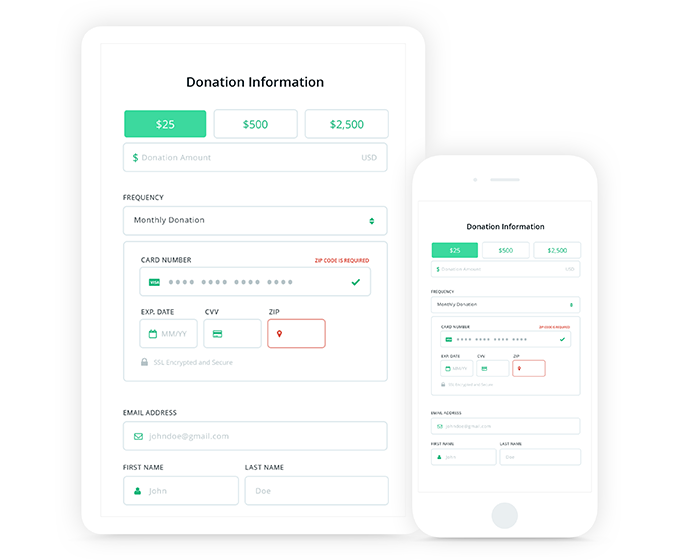
Overall, too much information can be overwhelming and may ultimately distract individuals from the main purpose of your form: to submit a donation. Take a look at the following example which exemplifies a straightforward donation form that limits distractions and drives donors through the process:
9. Improve your donation page load speed.
When it comes to donation pages, every second counts. With slow load speed, you risk a much higher bounce rate — the percentage of visitors who leave your website after only visiting one page.
A 100-millisecond delay in website load time can hurt conversion rates by 7 percent.
That's a pretty significant opportunity for improvement. To reduce load time for your donation form, try out these best practices:
- Compress and optimize images
- Reduce the number of animations, videos, and other top-heavy elements
- Leverage browser caching
- Minimize the use of JavaScript and excessive CSS formatting
Aim to avoid extraneous information and load-time-consuming graphics that will clutter and slow down the donation page.
10. Be mindful of what appears above the fold.
The "fold" is a term used by web developers to describe a web browser's bottom window. The phrase "above the fold" refers to the content that's visible above the border when the page initially loads, whereas "below the fold" refers to the content that can only be viewed by scrolling down.
Eye-tracking research has shown that 80% of users' viewing time is spent above the fold.
In other words, the area above the fold is prime real estate. As such, you need to ensure this content is bold and engaging while representing your nonprofit’s mission and incorporating your branding.
Ensure the following essential information on your donation page is visible above the fold:
- A compelling reason why donors should give
- Donation form fields
- Your call-to-action
Even if a visitor doesn't scroll at all, they'll have all the information they need to give to your cause.
On the other hand, while your navigation bar should appear above the fold on all other web pages, you'll want to hide it on your donation page. Otherwise, you risk directing each supporter away from moving forward with their transaction, which works against your conversion goals.
11. Improve your donation page’s ‘Submit’ button text.
Remember, a donation to your organization is more than just a transaction; it's a contribution supporters are making to a worthy cause. Treat it as such by ensuring the wording used on your submit button reflects the importance of donating.
While the wording may seem like a small detail, it can make your donation page much more compelling. Tweaking the text on your submit button reminds donors why they're donating while still making it clear that this is the final step to give. This will work to ensure their visit to your nonprofit's donation page doesn't go to waste.
Instead of simply labeling it "Submit," consider using more vivid language. Adjusting it to say, "Make a Donation," "Submit a Donation," or "Donate Now" can be much more influential. You may even consider making the language more specific to your organization's mission.
Regardless of the wording you select, ensure it communicates the idea that by clicking it, the donation will be submitted. Otherwise, prospects may be taken by surprise if they were expecting the button to take them elsewhere.
See how this campaign page adds a layer of urgency by using the terminology "Donate Now":
Compelling Content on Donation Pages
While your donation page is primarily designed to collect contributions, you should still provide some context as to where those contributions are going. The individuals who visit your donation page have likely already familiarized themselves with your cause. For that reason, it’s important to be concise, yet compelling. The purpose of enticing content should be to help maximize gifts, summarize your cause or campaign, and drive heartfelt contributions. Let's dive into a few ways to accomplish this on your donation page.
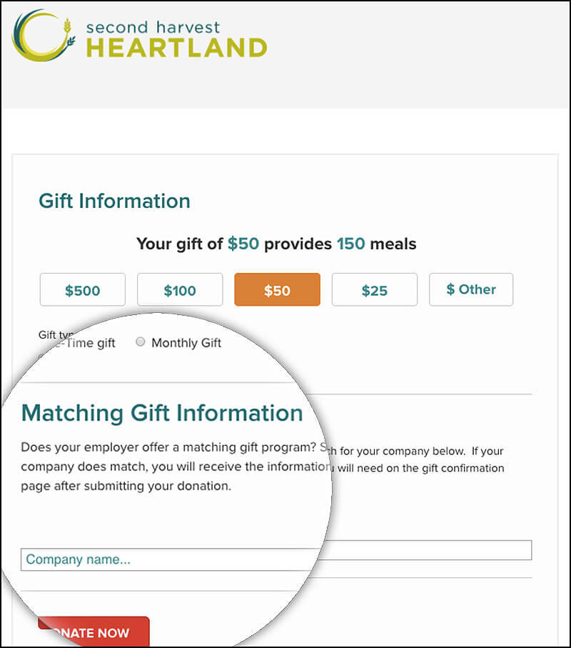
12. Highlight matching gifts on your donation page.
If you've spent some time in the nonprofit sector, you've likely come across corporate giving programs. In short, companies give back to the causes their employees care about by offering philanthropic programs.
Matching gifts represent one of the most common programs. Through a matching gift program, companies offer to match their employees' donations, usually on a dollar-for-dollar basis. In other words, you can double some of the donations you're already receiving.
1 in 3 donors say they'd contribute a larger gift if they know they're match-eligible.
To harness the power of corporate giving programs, embed a matching gift search tool on your donation page. Access to a database will allow supporters to search for their employers' programs and instantly be met with the following information:
- Donor eligibility requirements
- Nonprofit eligibility requirements
- Match ratio (e.g. 1:1, 2:1, etc.)
- Minimum and maximum match amounts
- Any available match request forms
For optimal results, give donors an additional opportunity to view their eligibility by featuring this tool on the confirmation page as well.
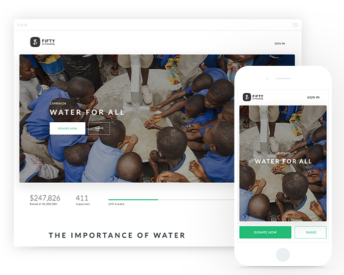
13. Feature compelling imagery on your donation page.
To start, you should feature original photos. This will help donors associate a face with your mission and remind them why they're giving to your cause. Avoid stock photos and generic-looking images altogether.
>For optimal results, showcase those who you serve. For instance, if you’re fundraising for a school, feature some students hard at work in a classroom. If your organization is an animal shelter, feature one of your furry residents. This will be much more likely to resonate with those who feel strongly about your mission.
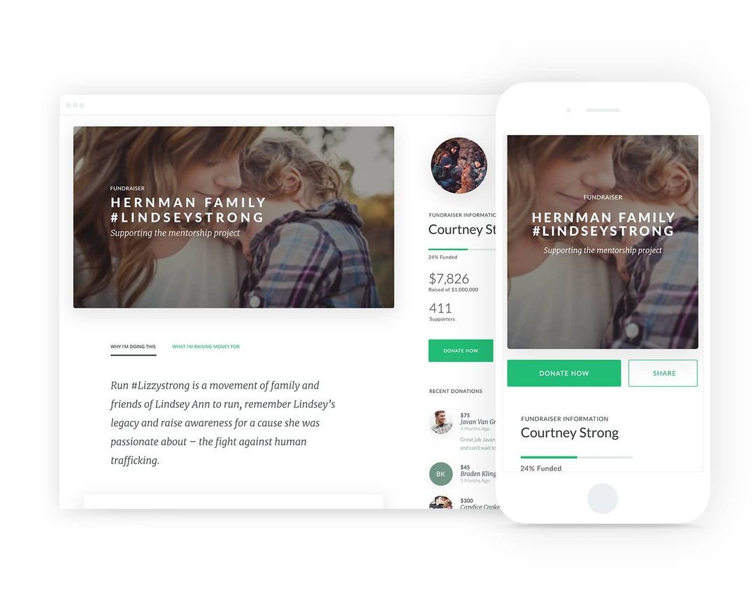
From here, you should include a single banner image so as not to overload the page. As we've mentioned, you'll risk distracting your prospects if you include too many images on your donation page. Since you'll be limited with space, be extra selective. See how the Water for All campaign clearly displays the fundraiser's purpose with a single impactful banner image:
14. Include a compelling “Why.”
In case donors are still on the fence about giving, you should offer a brief but helpful explanation of how their gift will make an impact. Explain the purpose of the campaign and what the donor’s contribution will help accomplish.
Your donation page should not feel purely like a payment processing form. Instead, an enticing donation page gently reminds guests of why they've decided to give in the first place.
Also, remember that not every visitor arrives on your nonprofit's website with the intention to give. A bit of persuasion may be the slight push they need to take the final step and contribute.
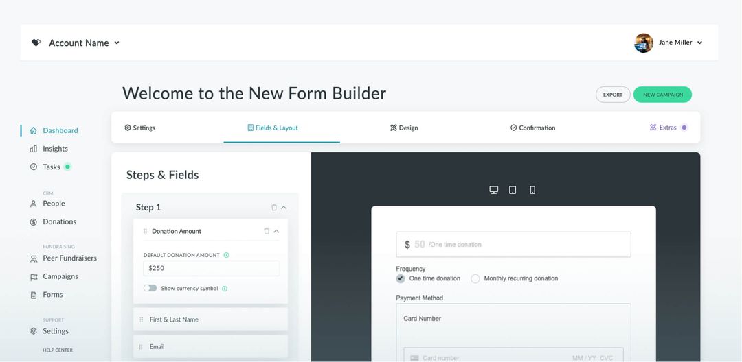
15. Customize donation page content fields.
When creating your donation page, customize the fields to capture essential information from your donors. By customizing each field, your donation page will reflect your organization’s priorities.
Further, these data points can be used to inform future fundraising appeals. For instance, you may consider asking for supporters’ preferred communication channels or inquire about how they found your cause. With this information, you can employ the most effective marketing channels, customize your marketing messages for widespread appeal, and much more.
Be conscious, however, that collecting too much information can slow down the donation process. Instead, move some questions to your confirmation page. This way, they’ll act as optional survey questions and won’t distract from the donation itself.
In the example below, you'll see how Donately enables you to customize each field on your donation form using our form builder:
16. Disclose how donations are used.
The best way to establish a trustworthy relationship is by being completely transparent with your donors. The best place to start is with your donation page.
When it comes to backing charitable causes, donors tend to look for specific information on a nonprofit’s performance and impact before they make the final decision to give.
75% of donors seek information about the nonprofit’s impact while 56% want a specific list of projects the organization supports in their work, according to Campaign Now’s research.
If possible, clearly define what percentages of your donations go toward various projects on your donation page. Or, if you use suggested giving amounts, tie each donation amount to a tangible gift. For example, you may choose to include a simple statement such as:
"A gift of $50 will provide food to a family in need for an entire month."
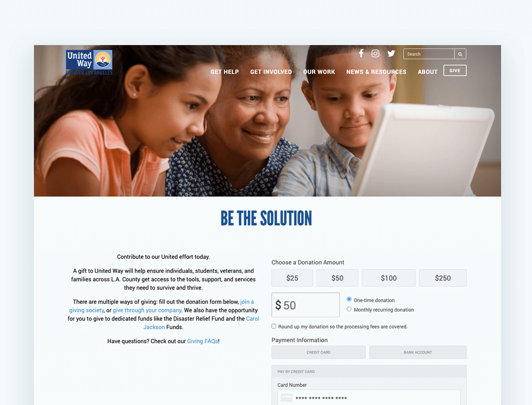
This level of transparency will make visitors feel secure in their decision to donate and let them know their contributions will be put to good use. Look at the following example to see how United Way clearly lists explains the tangible impacts of donations:
Financial Options for Donation Pages
Not everyone prefers to give in the same way. Because of this, you'll need to offer a number of financial options on your donation form. Let's walk through a handful of ways to increase options (and therefore conversions).
17. Offer recurring gifts on your donation page.
One of the best ways to increase your donation revenue without lifting a finger is by encouraging recurring donations. Using this strategy, you can give donors the option to automatically donate on a recurring basis, usually monthly.
According to Nonprofit Source, pre-selecting a monthly recurring gift option on your donation page can lead to 35% more monthly conversions.
Capture more recurring gifts with these best practices:
- Make the recurring option clear. Offer the option directly on your donation form for easy accessibility.
- Allow donors to manage their own giving. Donors should be able to update their personal information and recurring giving preferences with a few clicks.
- Acknowledge recurring gifts each time. Send personalized thank-you emails that explain how the donor’s recurring contribution is making an impact.
- Follow up when payments are declined. After a credit card is changed or declined, quickly work to rectify the donation sequence.
Recurring donations are a great feature to include on your donation page and can help generate additional revenue without a lot of effort on either end. By maximizing visibility, you’ll be on your way to maximizing your donation page’s efficiency.
In this example, the donation form includes a clear option to make the gift a recurring donation right below the amount:
18. Enable different payment options for donations.
Each donor will likely have a different preferred way to give. You'll want to provide several different payment options so donors can choose the option that's viable for them.
With the help of an effective donation processor, ensure you can accept the following payment methods:
- Debit/Credit Card
- ACH Direct Deposit
- PayPal or Stripe
From here, you'll want to list all available payment methods that your nonprofit can accept on your donation page. For example, show the icons of credit card providers you're able to process.
Regardless of which options your payment processor can accept, you'll want to make available options abundantly clear to encourage donors to give in ways that suit their needs.
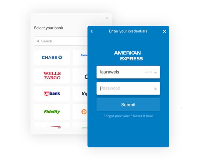
In the example below, our platform allows donors to search for their bank to initiate an ACH direct bank transfer:
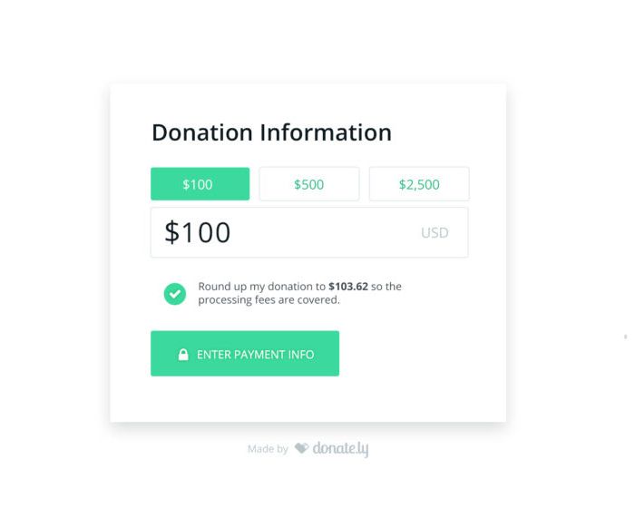
19. Pass the payment processing fees to your donors.
While on the topic of payments, you'll want to give your donors the option to cover the processing fees themselves. While these charges are typically minimal, the cost of processing gifts adds up as more donations roll in.
Chances are, your donors will be willing to pay a few extra dollars to ensure their entire donation goes to support your cause. The simplest way to offer this choice is to include an easy-to-select checkbox on your donation page.
With Donately, you can quickly enable this option on your donation forms, and if your donors choose to select it (and we've noticed that many do), your operational costs can drastically decrease. Take a look for yourself:
20. Make giving on your donation page secure.
Any time you collect personal data (especially payment information), it's important to have extra security measures in place. If donors think their information is at risk, they'll wind up not donating at all. Or worse, if your organization experiences a security breach, you’ll have difficulty convincing donors that you’re trustworthy again.
Secure giving all starts with a payment processor that's PCI-compliant, meaning it follows industry protocol for protecting payment data. Your platform should also authenticate and encrypt payment information using secure sockets layer (SSL) technology.
In short, SSL is the standard security protocol for establishing an encrypted link between a web browser and a server. With safety measures such as these, donors can be fully confident that their data will be protected when using your donation page.
Donately comes equipped with payment processing tools that check all of these boxes. With Stripe and PayPal as our payment gateways, our payment processing is fully PCI-compliant, giving you and your donors peace of mind.
By taking extra security precautions on your donation page, donors will trust your team and won't think twice about giving to your organization.
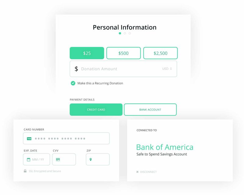
21. Include suggested giving amounts on your donation page.
When done strategically, offering different giving levels on your donation page often results in higher donations. This works for two reasons:
- Giving is simpler when all the donor has to do is click a button.
- Donors naturally use suggested giving options as a reference point for how much others are giving (and therefore, how much they should give).
Suggested giving amounts should vary with each organization. Simply determine what your average donor contributes and then create options that are marginally higher. For example, if your average donation amount is $20, you might make your lowest suggested amount $25.
After a sufficient amount of time, you may even consider adjusting those levels based on results. This is where investing in an online giving platform that automatically tracks donation data will come in handy, so you don't have to worry about determining these KPIs manually.
Proactive Marketing for Your Donation Page
Once you've taken the time to optimize your donation page design, you'll want to maximize its visibility by sharing it with prospects. Otherwise, you won't receive nearly as many donations as you'd expect. Let's explore a few ways to improve outreach to promote your donation page.
22. Promote your donation page using Google Ads.
Every day, philanthropic people search online for nonprofits to support. Nudge them toward your cause by promoting your donation page with Google Ads. Creating ads that target terms related to your mission will help increase your form’s visibility, drive more traffic, and ultimately encourage donations.
Best of all, paid advertising for nonprofits isn’t out of the question thanks to the Google Ad Grants program. Any eligible nonprofit can receive up to $10,000 monthly to promote their web content (including their donation pages) on Google.
To make the most of the opportunity, a few elements you should consider when crafting your ads include:
- Keywords: Choose keywords relevant to your mission, so you can promote your form to people interested in donating.
- Ad copy: Write compelling ad copy that highlights your nonprofit’s impact and includes a call to action encouraging people to donate.
- Targeting: Leverage Google’s targeting features to reach specific audiences based on demographics, interests, and behaviors. That way, you can connect with likely prospects.
While a great opportunity, the program has a learning curve, especially for strategies like ad extensions. You’ll want to devote some time each month to monitoring performance, too. That’s where a Google Ad Grants manager can step in. From choosing keywords to crafting your ad copy, they’ll handle every aspect of your ads, so you can maximize your donation page’s visibility.
23. Share your donation page across multiple platforms.
Unlike many other mediums of donating (like direct mail and in-person contributions), donation pages are highly shareable. This makes them great opportunities to expand your reach to acquire new supporters!
Let's take a look at two suggestions for maximizing your donation page’s visibility:
- Link back to your donation page across your marketing materials. Your communications team churns out hundreds of fundraising appeals. Simply link back to your donation form in each message with links in emails and social media posts. You can even add a QR code to flyers or direct mail that links to your donation page directly.
- Add links to your social media profiles. According to NonprofitSource, 55% of people who engage with nonprofits on social media wind up taking some sort of action, 59% of which donate money. Direct social media visitors straight to your donation form by adding the link in your social media profile descriptions (e.g. your Facebook page's 'About' section).
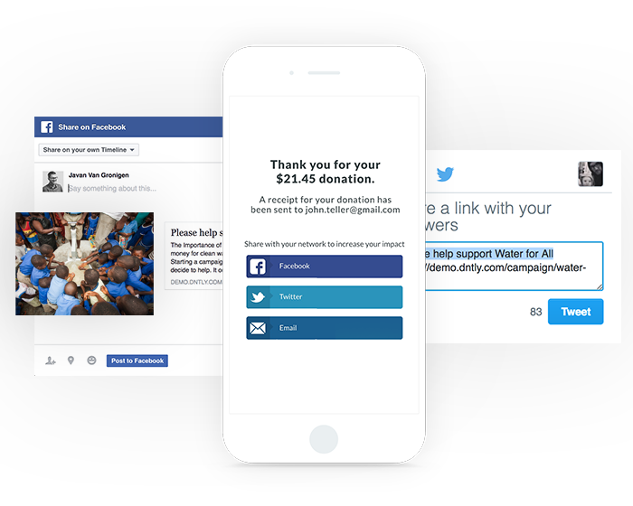
24. Encourage donors to share their gift on social media.
Creating an option on your donation page for donors to share that they contributed to your cause is an organic way to widen your audience. When donors share that they made a gift, they're also inspiring their network of friends and family to join in and give.
Be sure your donation page provider gives the option to add social share buttons, so you can easily harness the power of social proof. The idea behind this concept is that humans tend to mirror the actions of others, so long as they believe it reflects the correct behavior.
Further, make sure to include sharing options for all the platforms that your donors are most active on, whether it's Twitter, Facebook, Instagram, or LinkedIn (or all of the above!). See how easy social share buttons make the marketing process:
25. Ask donors how they reached your donation page.
There are several ways someone could cross paths with your organization, and simply guessing won't get your nonprofit anywhere. On your donation form or confirmation page, consider including a field with a dropdown menu that features options such as:
- A friend or family member referred me.
- I'm a staff member or a board member.
- I've attended one of your previous fundraising events.
- I came across your Instagram profile.
- I came across your Facebook page.
- I came across your Twitter profile.
By determining this upfront, you'll save your team time in prospect research efforts and can gauge your most effective marketing strategies. You'll gain useful insight into your donors' preferred communication platforms, so you can focus your efforts there.
Just be sure to leave this question as optional. Remember, the last thing you want to do is slow your donors down, but providing this extra opportunity to engage can be invaluable to guide your nonprofit toward more effective marketing. With a customizable donation form, you'll be able to easily add this extra field.
Accessibility of Your Donation Page
As with any other part of your nonprofit's website, make sure as many people as possible are able to interact with your donation page. Let's walk through three primary ways to improve this page's accessibility.
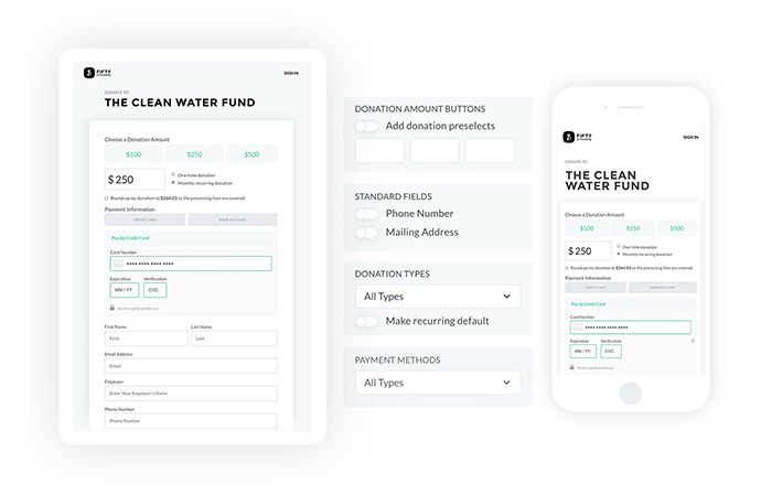
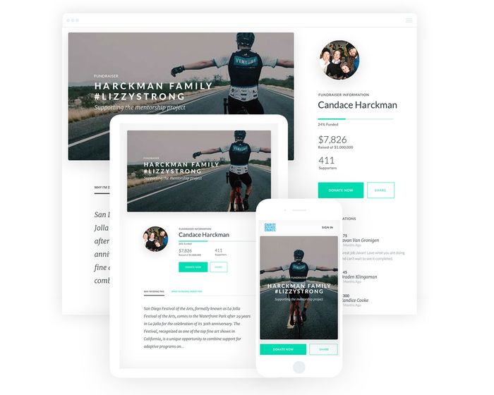
26. Make your donation page mobile-friendly.
One of the most effective donation page best practices revolves around mobile-responsiveness. When your form is easily viewable from mobile devices, individuals can conveniently donate wherever they are.
According to Double the Donation, mobile devices account for half of all nonprofit website traffic.
Mobile-responsive donation pages allow you to:
- Make viewing your content easy. A responsive donation page will adjust to fit any screen size, so donors can easily interact with content from their smartphones, tablets, or other devices.
- Give donors a good experience on your page. They won't have to zoom in or out in order to read and fill out your donation form.
- Avoid worrying about poor formatting or readability. From your branding and images to your fields, with a mobile-responsive platform, everything will be automatically resized, reformatted, and readable.
If an individual is forced to hold off on donating until they have access to a desktop computer, they may forget altogether. Remember, many of your supporters likely come across your marketing materials on their mobile device (e.g. email and social media), so make it easy to donate and avert all frustrations by making your donation page mobile-responsive!
As an example, see how this donation form by Donately looks great on every device:
27. Make your donation page easy to find.
This might seem obvious, but if your donation page isn’t clearly promoted on your organization's website, individuals won’t know where they can contribute.
Try out these steps to make your donation page stand out across your website:
- Prominently display a “Donate Now” button on your website. This should be easy to spot (especially on your homepage) so donors know where they can go to contribute within seconds of your website loading. Consider adding this as a button above the fold.
- Use a bright color to highlight the donate button. Ideally, use a color that will stand out most against the background to immediately catch users’ attention.
- Include calls-to-action throughout your website. Sometimes donors will still be on the fence about giving. Include some inspirational words on strategically-placed CTAs inviting them to contribute and make an impact.
- Choose a short and simple URL. Make sure your online giving page has an easy and memorable URL so that supporters can quickly access your form and make a donation. This also helps for including your donation page URL in offline materials like direct mailings and flyers that users will have to type themselves.
If it’s a challenge to navigate to your donation page, you won’t drive nearly as many visitors, and in turn, you'll decrease your conversion rate. Be sure that clicking links and CTA buttons takes individuals directly to your donation page. Keep everything simple and people will be much more likely to complete the donation process.
28. Adhere to online accessibility guidelines.
Maximizing your online fundraising potential means making your donation page accessible to everyone. This means that you'll need to comply with web accessibility guidelines so that people with disabilities or impairments can still interact with the page.
According to the Web Content Accessibility Guidelines (WCAG) 2.1, you'll need to proactively implement tactics such as the following:
- Use high-contrast colors. WCAG 2.1 requires a minimum color contrast ratio of 4.5:1. For context, the highest contrast ratio is black text on a white background, which is 21:1.
- Clearly label fields with the text outside of the field itself. This will help those with screen reader technology to understand what information they need to provide.
- Add alt-text to images. Alt-text, short for alternative text, is a phrase or sentence added to an image's HTML coding that describes its appearance or function. Straightforward alt-text helps visually-impaired visitors with screen reader technology.
By intentionally adhering to accessibility guidelines, you'll make your donation page usable for a wider audience and enhance your design overall.
Further Engagement on Your Donation Page
The best donation pages encourage donors to continue interacting with the organization after contributing. Because of this, you'll want to design yours with stewardship front-of-mind. These four primary suggestions will help you cultivate relationships with donors.
29. Encourage other ways to give.
Making a donation is when supporter engagement is at its peak. However, that doesn't necessarily mean someone who has just donated won't want to get involved further.
In fact, including information about other ways to give will lead to higher donor engagement (and higher retention rates). Chances are, donors will want to be involved in more of your nonprofit's initiatives, such as:
- Volunteering
- Attending events
- Taking part in your peer-to-peer campaigns
- Signing up for your email newsletter
When presenting these options, just be sure not to distract them from the task at hand: completing your donation form. You may consider asking about their interest in each activity in the form of checkboxes instead of including entire sections detailing each choice. Alternatively, you may consider asking about their interest or linking them to other opportunities from your confirmation page to keep the donation page itself from getting cluttered.
30. Encourage donors to create their own accounts to simplify giving.
The ability to create an account simplifies the future online giving process for both your donors and your team. For one, this will make it easy for your organization to keep track of each donors' past giving history. Plus, supporters who have donated before won't have to fill out the standard fields (like name, address, and other data) on the donation form again.
This feature is especially great for your recurring donors. They'll be able to log in to manage their giving, whether it's to change the frequency and amount or update their payment details.
To simplify the process further, your online donation software should enable donors to create an account using the information they've already submitted on the donation form. However, creating an account shouldn't be mandatory. Requiring this step may turn some prospects away if they feel uncomfortable with allowing your nonprofit to store their information.
31. Continue engaging with donors after they give.
Your relationship with donors doesn't end the second they click the 'Submit' button on your donation form. In fact, this is where these relationships propel forward. That's why it's so important to have a stewardship strategy in place.
Think of it this way: you've already secured the first donation from them. How are you going to secure a second?
To kick off your relationship on the right foot, you'll first want to follow up immediately by using these three steps:
- Feature a confirmation page. As soon as a donor submits their donation, reroute them to a branded confirmation page that immediately alerts them that their gift was received.
- Send a donation receipt. Make sure your donors know for certain that their payment went through with an automated donation receipt. This is required for supporters who give over a certain amount but is appreciated by all supporters, no matter their contribution size.
- Conduct appropriate follow up. While these two confirmations are great, you'll want to follow up with a personalized thank-you note within 24 hours. Here, you can also give donors next steps, such as following your nonprofit’s social media accounts or downloading a guide about your mission.
Put your online fundraising software (like Donately!) to good use by using it to power automatic donation receipts, which can help you begin stewarding your donors immediately.
32. Incorporate your donation page into your virtual events.
Your nonprofit's donation page isn't a standalone fundraising tool. Rather, it plays into the bigger picture and should be incorporated throughout all of your online fundraisers.
As organizations continue to host virtual and hybrid events, this presents the perfect opportunity to incorporate your donation form across all fundraising channels. Here are just a few ways your team can include your donation form in your virtual events:
- Share it across promotional messaging. Leading up to your event, encourage registrants to submit additional gifts by featuring your page across event messaging. This will simultaneously work to motivate those who are unable to attend to make a contribution.
- Use it to collect donations during the event. Give donors an additional chance to further their impact if they're feeling particularly motivated during your fundraiser by sharing the link to your donation page.
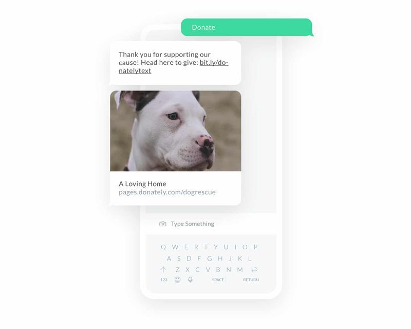
- Drive traffic using text-to-donate. Make giving convenient by sharing your organization's text-to-donate number in campaign messaging, both before and during the event itself.
As you can see, there are several ways to perfect your donation page. As you go, analyze your progress and determine what motivates your prospects. This way, you can refine your donation page so that it's most appealing to your unique audience of supporters. In no time, you'll drive more donations and maximize your online fundraising potential!
Gaining inspiration from tips and examples that have worked for other organizations is a great place to start optimizing your donation page. But you can never know too much on the subject! Dive deeper and expand your knowledge further by reviewing the following resources:
- 17 Best Online Donation Tools + Software Best Practices. Learn more about the top online donation platforms for fundraising, events, and donation processing. Plus, check out four best practices for using online donation tools.
- Peer-to-Peer Fundraising: The Ultimate Guide. Thinking of empowering your supporters with a peer-to-peer fundraiser? Use this guide to ensure you know the basics, and discover the best ideas and software solutions..
- 15 Best Fundraiser Websites: The Complete List. Your donation page isn’t the only part of your website that drives donations. Get inspired by these successful fundraising websites to improve your own.