4 Effective Web Design Strategies That Can Boost Donations
Many nonprofits don’t give their donation page enough attention and lose out on much-needed donations. Learn how to harness web design to make yours stand out.
Chances are, a lot of your nonprofit’s fundraising work has shifted online. Not only has this happened as a result of the pandemic, but also because virtual fundraising is an effective strategy that helps you connect with your supporters in their everyday lives. Online giving, when set up right, is a fast and convenient way for donors to contribute to your cause.
Research backs this up, too. According to this nonprofit fundraising statistics resource, 63% of Canadian and American donors prefer to give online with their credit or debit card. This means your website can be a great platform for fundraising. However, for many nonprofit fundraising professionals, it’s a challenging task to create a website that effectively encourages online giving, especially because you’re probably not a web design expert.
This is why it’s helpful for your team to have a content management system (CMS) built with nonprofits’ needs in mind and some knowledge of some web design basics. With these tools, you can design a professional website and create a donation page that helps secure the essential funds necessary to furthering your cause.
In this post, we’ll give you four effective web design strategies that will enable you to raise more— whether you’re preparing your website for something specific like a Giving Tuesday campaign or looking to give your everyday fundraising an edge. Those four strategies are:
- Adhere to accessibility guidelines.
- Optimize for mobile devices.
- Create a short and intuitive donation form.
- Incorporate multiple giving options.
As your team uses these strategies to design an effective donation page, keep the user experience top of mind with every decision you make. It can be easy to think abstractly about your donors as you design a page with user-friendly tools, because you’ll be eager to get great results. Instead, take a walk in your donors’ shoes and think through what they need and want from your donation process. Let’s jump right in!
1. Adhere to accessibility guidelines.
If you’re looking for ways to boost donations for your organization, start by thinking about how the giving process works for all of your donors. One great way to do this is to optimize your website for accessibility. Adhering to the official Web Content Accessibility Guidelines (WCAG) will allow you to set your website up as a tool people of all abilities can use to give.
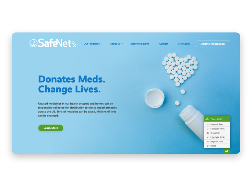
When you’re choosing a CMS to design your organization’s website, look for a platform that can help you easily take care of accessibility details. Some CMS platforms will provide widgets that make accessibility optimization a cinch, allowing website visitors to adjust text size, change fonts to non-serif, highlight links, or change pages to grayscale for a better experience.
Beyond including an on-site accessibility widget, here are some accessibility guidelines to keep in mind when you’re designing your website:
-
Use high contrast colors for all text and graphics. WCAG requires all text and images of text to have a contrast ratio of at least 7:1. Note that black text on a white background provides the highest contrast ratio for those who are visually impaired.
-
If you have a lower contrast ratio, aim for large text with wide character strokes. Text like this is easier to read for people who have moderately low vision. This rule of thumb also allows you to use a wider variety of colors on your site.
-
Include alt text for images. This will prepare your website for visitors who are using screen readers to interact with your content. Alt text is simply a descriptive sentence that describes a photo to those who can’t see it.
As a nonprofit organization, you know the importance of spreading your cause far and wide. Don’t let your organization inadvertently close doors to welcoming more donors into your operations! Optimize your website for accessibility so everyone who wants to be part of your mission can use your website to donate and get involved.
2. Optimize for mobile devices.
Another web design strategy to help you reach the most donors possible is to optimize your website for mobile devices. Not all your donors will be sitting down at a computer to fill out your donation form. Some will give on tablets, while others will want to give on-the-go using their phones.
When your website isn’t mobile-friendly, donors may have to zoom in and out to see your content, rotate their device for a better viewing experience, and, in some cases, may get frustrated and abandon their plan to give altogether.
You can avoid letting this happen to your donors using mobile devices by taking the following steps:
- Choose a nonprofit CMS that offers automatic mobile responsiveness and optimization.
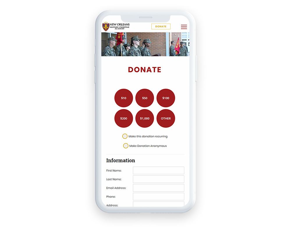
- Make your donation form “thumb friendly” by including drop-down lists and single-input areas.
- Ensure that popups scale for a mobile screen so users can “x” out.
- Compress images and limit the number of website elements so your website doesn’t take too long for mobile users to load.
Making your website mobile-friendly allows you to meet donors where they’re at. A mobile-responsive site will signal to your donors that you want the giving process to be convenient for them, which goes a long way in encouraging them to come back to your organization when they want to give again.
3. Create a short and intuitive donation form.
Your donation form is where the actual act of giving happens, so you’ll want to focus a lot of your website design effort on making your form (and the rest of your donation page) the best donation tool it can be. Remember that donors want a convenient experience that doesn’t take long and is easy to understand. They also want to feel like your organization values them and their contributions.
To accomplish that and provide an optimized experience, here are a few donation form best practices to follow:
-
Embed your donation form directly into your donation page. Instead of making donors go to a third-party site to donate (which can seem untrustworthy, even if it’s not), embed your donation form directly into your donation page. This will make the act of giving feel much more connected to your website, and, by default, your mission.
-
Brand your donation form to your organization. According to Morweb’s list of donation page design tips, “Visual consistency maintains the element of trust for your donors as they navigate on your website.” Use the familiar colors, logos, and fonts that make your organization unique. Don’t just opt for a generic donation form.
-
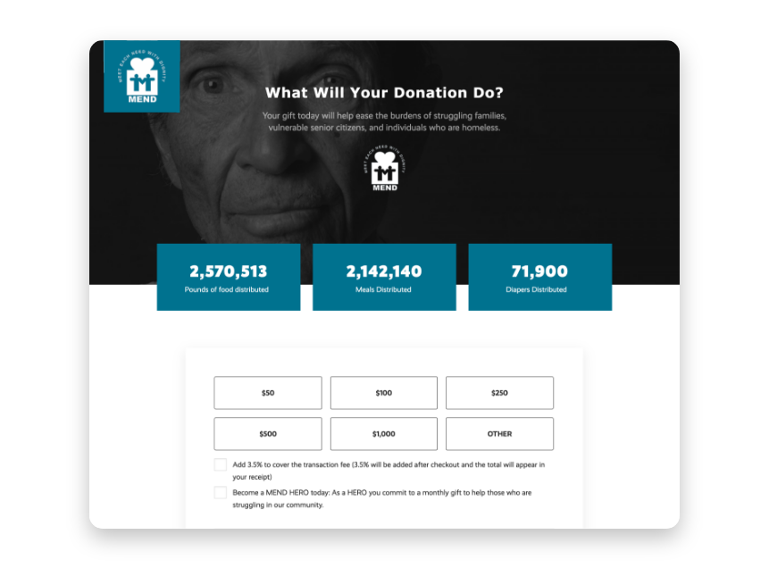
Include an eye-catching photo or a short, humanizing story that illustrates your cause. To convert website visitors into donors, it’s a smart idea to remind them why they’ve come this far and what they’ll be funding.
-
Keep the form short by only asking for necessary information. Supporters don’t like to feel like they must share all their personal details in order to donate to a cause they care about. It takes a long time and can feel like an invasion of privacy. Only ask for the necessary information like name, address, contact information, and payment information.
-
If you want additional information from your donors, indicate that it’s optional. You may want to collect other data from your donors, like preferred methods of contact or how they heard about your organization. Clearly mark which fields on your donation form are required and which are optional so donors can choose whether or not to give more information.
-
Make sure each donor is thanked for their generosity. Donors like to feel appreciated by their chosen nonprofit organization. Set up an automatic thank you to be emailed out after every donation, or, better yet, write personalized thank-you notes or emails to let your donors know you truly care. This will help your organization retain the donors that mean so much to your cause.
Your donation page and form are arguably the most important parts of your nonprofit’s website. If you truly want to boost donations, work with your team to think through the donor experience with your online giving tools. Look for ways you can follow the best practices we’ve outlined here to make it a simple process for your supporters to contribute to your cause.
4. Incorporate multiple giving options.
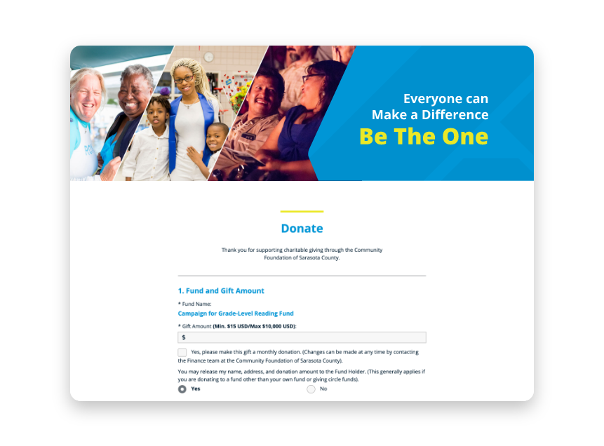
Another great way to boost the funding your organization is getting is to offer your donors more options. Donors want the opportunity to customize how they give, and often, that means they get more and more involved with your cause.
Giving your donors multiple giving options doesn’t just mean accepting debit card, credit card, and ACH payments, though you should. You might also offer:
-
A monthly giving program: Many donors want to give on a regular basis, but might forget to return to your donation page or would rather not enter their payment information over and over again. Set up a monthly giving option in your donation form to make their donation a recurring transaction. When they’re automatically billed every month, your donor won’t have to think through the steps of giving anymore. Instead, they can contribute consistently and easily.
-
A matching gift database: A search tool like 360MatchPro offers donors the opportunity to find out whether or not their employer participates in donation matching. Embed a matching gift database that donors can search to find out if their gift is eligible or not.
Offering more than one way to give is an excellent way to engage your donors beyond a one-time donation. If you know your donors would benefit from another way to give, don’t hesitate to set up that opportunity for them. It might take some time and effort from your team to get that option up and running, but it will definitely pay off as you bring in more donations and find lifelong supporters to back your cause.
The Gist
Website design can be intimidating, especially if you’re a nonprofit professional looking to increase online donations without a clue where to start with design. Employ these four strategies and use a nonprofit-specific CMS to get the results your organization wants to see. In no time, you’ll optimize the giving experience and solidify your relationships with supporters. Happy fundraising!


