Tips for Using Images in Your Nonprofit Emails

If a picture is worth a thousand words, a captivating image in your nonprofit’s email can be worth much more — like increased engagement and even donations. It just takes finding the best image and making sure it works for your newsletter.
Why images matter
The majority of people are visual learners, so it’s not surprising that images are an important part of email marketing campaigns: 51 percent of B2B marketers say creating visual assets is a priority for their content marketing strategy, and 32 percent say visual elements are the most important form of content for their business.
And they’re important to your subscribers too. Visuals increase a person’s willingness to read a piece of content by 80 percent, and 65 percent of users prefer emails that contain mostly images — compared to 35 percent who prefer text.
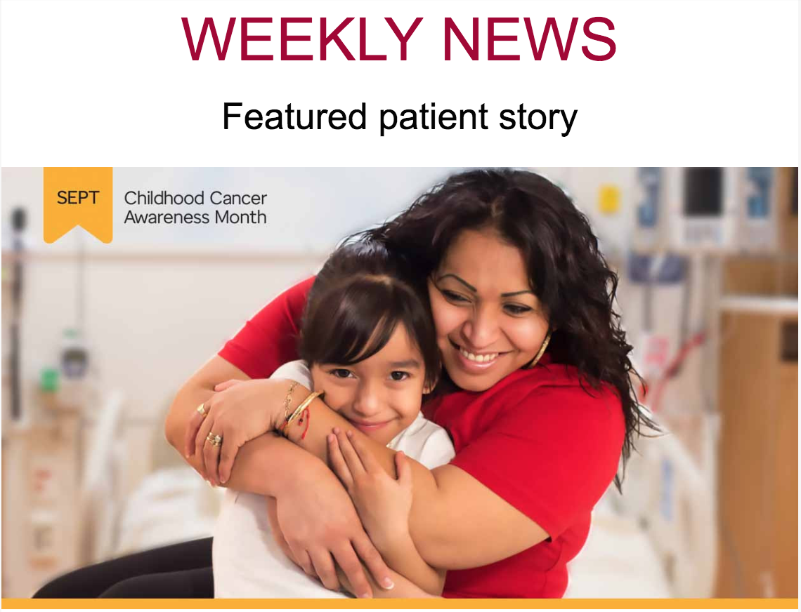
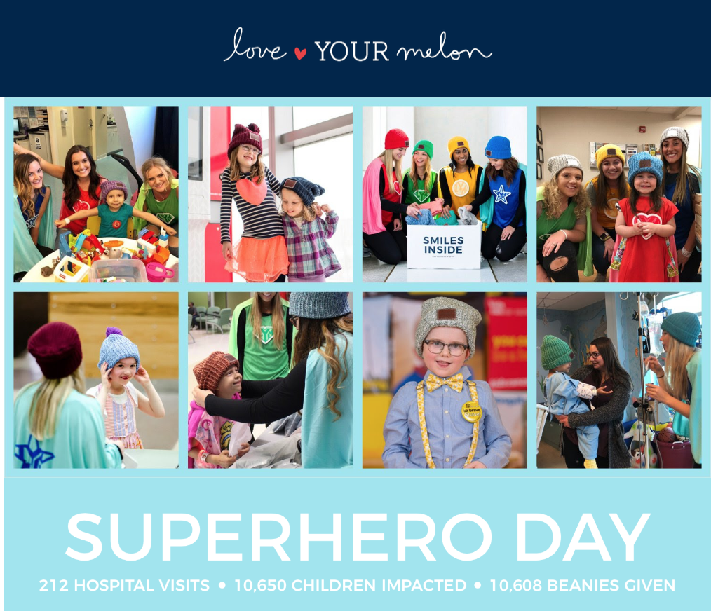
An eye-catching photo can break up text in your email, serve as a call to action, or display important information. They can put a face to your cause, show your subscribers where their dollars are going, and make people excited about being a part of your nonprofit — if you know how to use them correctly.
From what kind of images you should use to where to find them, we’ve put together a list of tips and best practices to get you started.
Consider your options
Visual elements come in all shapes and sizes, so you need to figure out what’s going to work best for your next email campaign.
Here are the top kinds of visuals marketers use most frequently:
- 35 percent: stock photos
- 30.4 percent: original graphics
- 15.2 percent: videos and presentations
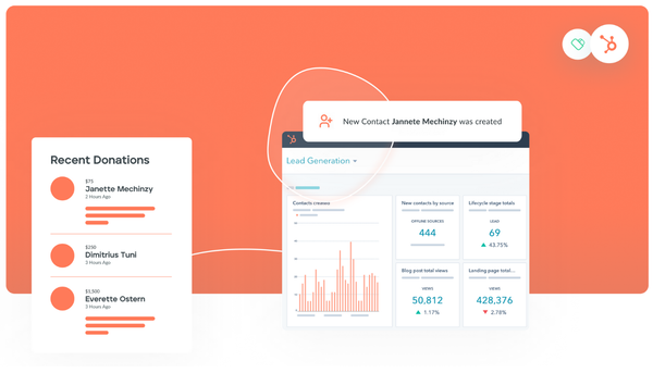
- 14 percent: charts and data visualizations
- 5.4 percent: GIFs and memes
Whatever you choose to go with should be a good fit for your nonprofit and the newsletter. For example, if you are sending an email to promote an upcoming event, you can use an original photo from last year’s event to show people exactly what to expect. A stock photo isn’t going to have the same personal effect in that situation, even if your original image doesn’t look as “professional.”
Or, if you’re sending a holiday newsletter for example, a stock image or GIF can be a fun way to greet readers. Mix up the types of images you’re using to keep subscribers surprised and excited to open your next message. You don’t want your emails to become stale and predictable.
Using images that feature people is also a great way to connect with your audience and catch their eye. It will humanize your nonprofit and cause.
Where to find good visuals
We’re sure you know by now that you can’t use just any image you find on the Internet. Copying a photo from someone else’s page or one that showed up in search results can lead to serious legal action if you don’t have the rights to use it.
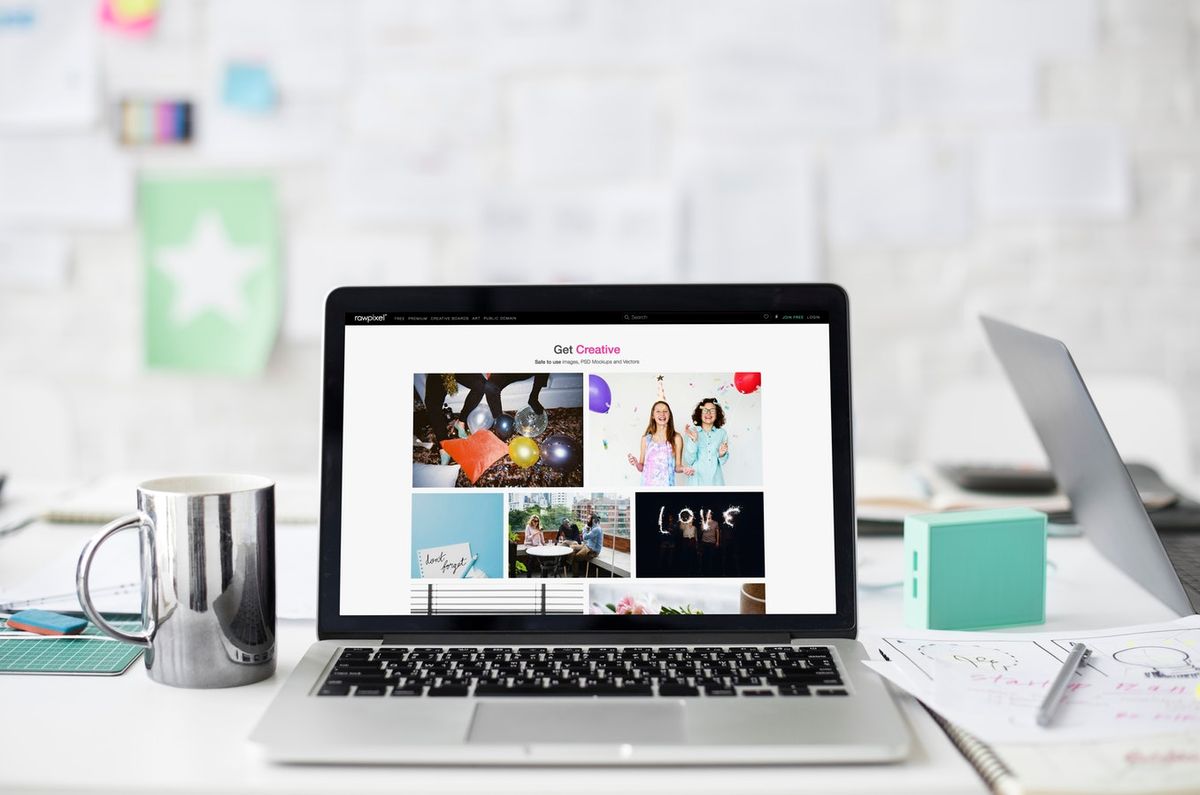
Luckily, there are several free options when it comes to finding eye-catching photos for your nonprofit’s next newsletter. Sites like Pexels, Unsplash, and Dreamstime offer a variety of photos and are free to use.
You can also use Creative Commons to search a variety of free sites — like Flickr, Pixabay, and Google Images — for royalty-free images. No matter where you find the image, though, be sure to read the fine print to see if the image can be modified or requires attribution.
If you need a specific, high-quality image you can’t find on any of the free sites, you can pay for photos using sites like Shutterstock and iStock. Shutterstock charges a monthly fee depending on how many images you want to download, and iStock offers credit and subscription-based plans.
In addition to going online for stock options, don’t be afraid to take photos with your handy dandy smartphone or camera. Those are useful when you need a specific or unique image that can’t be found anywhere else, especially if they feature your own events or team members. And with today’s technology, we can all be photographers. Just be sure to follow best practices, like using natural lighting (when possible), following the rule of thirds, and avoid zooming in.
Placement matters
Make sure your subscribers see your image right off the bat by keeping it above the fold, no scrolling required. It could be a thin header image or your main photo. You want it to be front and center, instead of hitting them with a big chunk of text.
You can even combine your main image with a text overlay to get the message across, like with a CTA or opener. Just be sure to include some other body text so they will see a message if they have their images turned off.
Also, make sure there’s a hierarchy to your images so the viewer knows where to look first. That’s more visually appealing and draws their eyes where you want them.
Don’t forget the basics
Beyond the creative aspect of choosing images for your emails, you also need to focus on some of the more technical components of your photos.
One of the main things you want to do is make sure your subscribers actually see your image — and that’s only going to happen if it’s the right size. An image that’s too large might be slow to load, not load at all, or even send your message to spam. Avoid that problem by compressing your photos to web-res versions.
Beyond reducing the image size, make sure to add alt and title text to all of the visuals you include in your newsletter. Your subscribers will see the alt text if the image doesn’t load or they have images turned off, and it can give them additional information on what they’re seeing. This text also describes what the image is for the visually impaired using screen readers.
Another important element to include is title text, which is what they’ll see if they hover over the image. Most platforms will give you the option of filling in the alt and title text for the image when you load it into your email design. You can make the alt and title text the same.
Put them to the test
You think the image looks great, but what do your subscribers think? To figure out which photo or other visual element will get you the best results, conduct A/B testing with different image options. It’s a type of experiment that shows subscribers variations of an email to see which one performs the best.
You can test different image styles, placements or types to see which one performs the best. Just be sure to only test one variable at a time: You need a control and test version. For example, use two different images in the same spot or use the same image in two different spots during the tests. That will give you a clearer picture of what works best.
More powerful than words
Make your messages stand out with subscribers with compelling images, whether that’s a photo from your last project, someone your nonprofit has helped, or a past event. Visuals can help you tell your nonprofit’s story and connect with current and potential donors.
You just need the right image to tell it.
Author bio
Lauren Dowdle is a writer for Robly Email Marketing based in Nashville, Tenn. Her nearly decade-long writing career has covered everything from landscaping to marketing.