Fundraising Inspiration: How to Design Emails for Donations


You want to collect money for your fundraiser. You know it, and your email subscribers know it. But, you need to make your message and design about so much more than a dollar amount if you want to be successful.
Before we tackle what to do with your campaigns, here are a few stats that show why fundraising emails are a such profitable tool for your organization:
- Email messaging accounts for 26 percent of online fundraising revenue.
- The average revenue raised per 1,000 fundraising messages delivered is $36.
- Email results in 1/3 of online fundraising revenue.
The benefits of sending emails for your fundraising efforts are easy to see. But to enjoy those benefits, you need to build a message that’s as engaging as it is informative. The best email campaigns don’t just catch people’s attention with what they say: They also draw subscribers in with the look and feel of the message.
To help get the creative juices flowing, we’ve put together some inspiring tips and examples to help you design the best fundraising email.
Get to the Point
You only have a few seconds to catch your reader’s attention, so don’t waste any time: Design a top-heavy email that tells them the who, what and why from the start.
This newsletter from Foodbank combines the header, main image, CTA text, what their donation will achieve and the logo — all within the opening section. That might seem like a lot, but it doesn’t look too busy and still keeps the focus on the captivating photo.
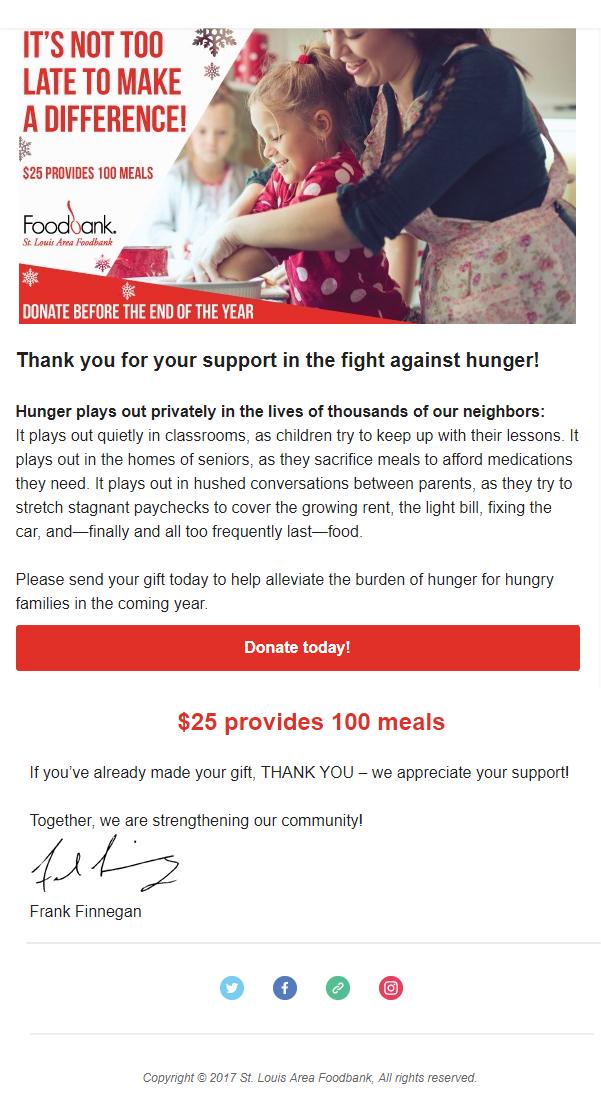
Having the CTA button at the bottom of the message helps balance out the design, and the text in the center isn’t distracting. You want to space out any large elements so the reader isn’t overwhelmed or confused where to look.
Turn Words into Art
A good design is about more than the colors, layout and images you use. Your words and fonts are just as important to the look and feel of your fundraising email. One nonprofit that knows how to create visually appealing text and designs is charity: water.
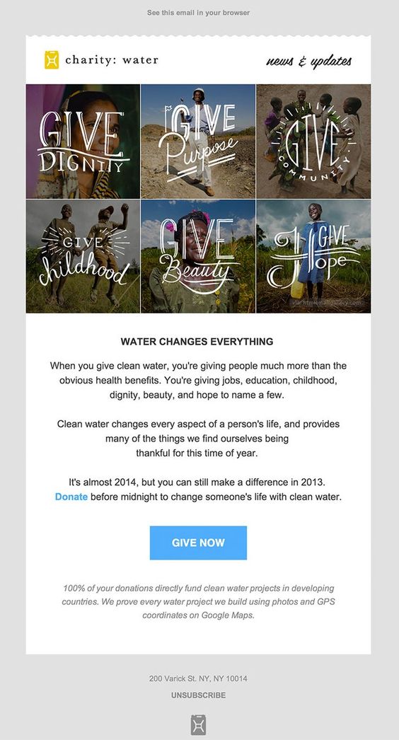
What makes this newsletter so inspiring is how it pairs each image with related phrases that all revolve around the main message of giving. They also turn the words into their own forms of artwork with fonts that look hand-drawn.
You could create a similar design by placing the text from a quote — what someone you helped said about your support — on a photo, for example. Use fonts and font colors that fit your brand, are easy to read and stand out from the image.
Touch Their Hearts
Why do you want people to donate? Will their money help support a family in need, provide food for the hungry or give someone access to much-needed medical care? You need to tap into their emotions to create a connection between them and your cause.
One of the best ways to do that in your email campaign is through the photos and images you use in the design. This fundraising example from St. Jude — part of their regular update email — puts a face to the hospital and their mission. Who can say no to these cuties?
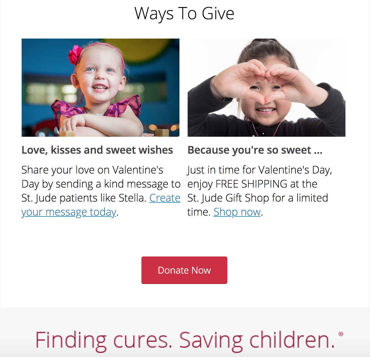
When you have engaging photos that highlight the people, animals or organizations your group is working to support, use them as anchor images — because photos tell a better story than text ever can. Avoid using stock images whenever possible to come across as more genuine.
Just be sure the photos relate to the email’s message and aren’t simply picked because they are visually appealing. The text and images need to work together.
Create a Clear CTA
The whole point of a fundraising email is to, well, raise funds. To get people to donate, you need to make it clear what you want them to do with your CTA. You want it to be as easy as possible for people to figure out how to donate.
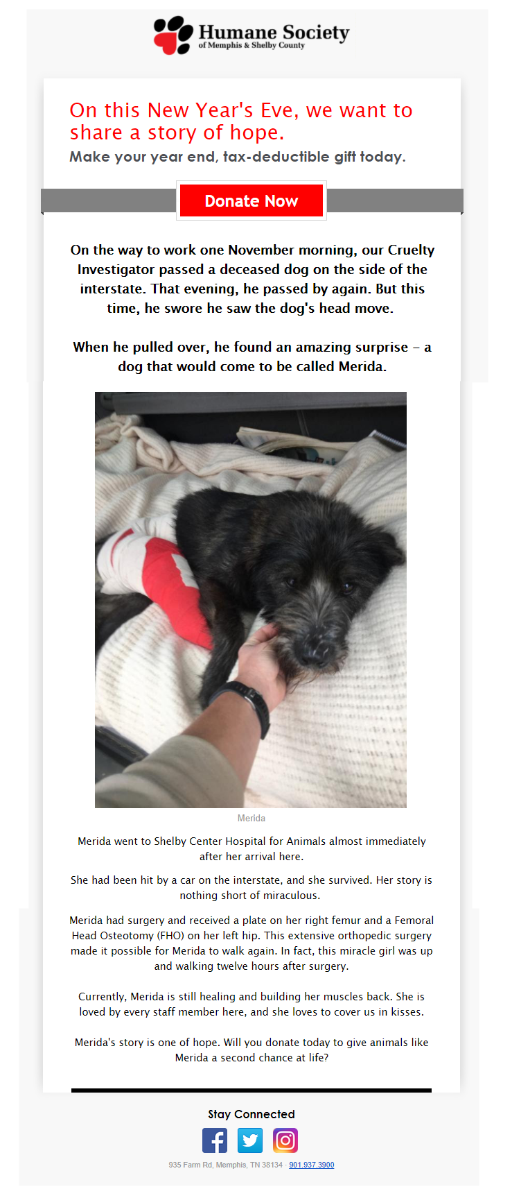
Putting the CTA above the fold will ensure your subscribers see it without having to scroll down. This example from the Humane Society puts the CTA front and center, using colors that tie into the overall design and their logo. The location of the CTA works here because the image is further down and doesn’t compete with the CTA.
The color of the CTA also needs to catch people’s attention. For example, use the same color as the header font for the button box. It will help tie the two together and give the elements prominence. You want to ensure your button doesn’t get lost in the overall message.
Don’t Forget to Say ‘Thanks!’
Show your appreciation for supporters who donate with an automated thank you email. That serves two purposes: It shows you have manners and are thankful for their gift, and the message also confirms you’ve received their contribution.
You can use the same basic template and colors from your original fundraising email to stay consistent with branding and help your audience recognize who’s sending the message. The design doesn’t need to be elaborate but can just feature an image and header text like, “Thank you for your support!”
You can also include a CTA that takes them to a page that keeps them up to date on the fundraising efforts — along with adding your social media icons at the bottom so they can follow and share the information.
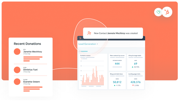
Find an email marketing platform that gives you a variety of templates, automation options and customer service so you have all of the tools to create the best fundraising email.
Author Bio
Lauren Dowdle is a writer for Robly Email Marketing and magazine editor based in Nashville, Tenn. Her nearly decade-long writing career has covered everything from landscaping to marketing.