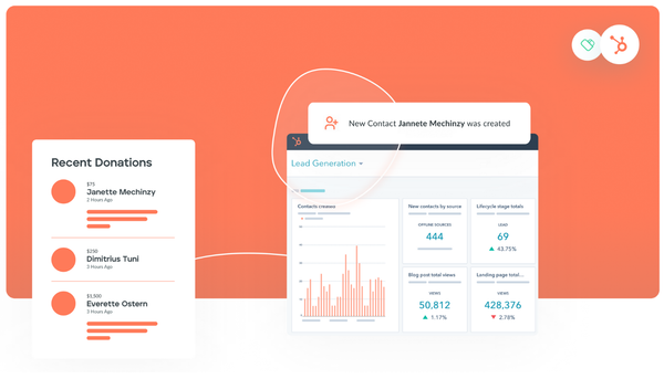
Introducing Donately's New Dashboard
Donately has launched a completely redesigned dashboard to help organizations of all sizes improve their online fundraising.

We’re thrilled to announce the launch of our redesigned dashboard. As one of our biggest releases ever, we’ve introduced a handful of new features while improving on a handful more. These updates should help you and your organization get more done in less time, giving you more resources to grow your impact online.
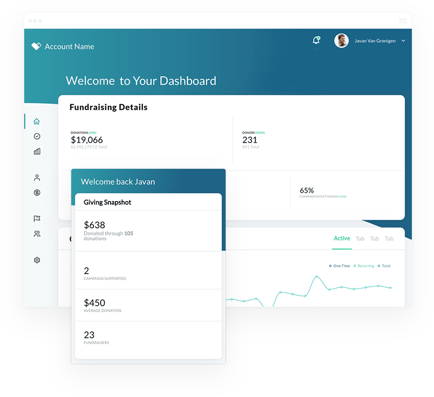
As always, we have relied on our users for the best way to improve to serve you best. Without further ado, here’s the complete list of the updates we made in our initial release:
Multiple Donation Forms
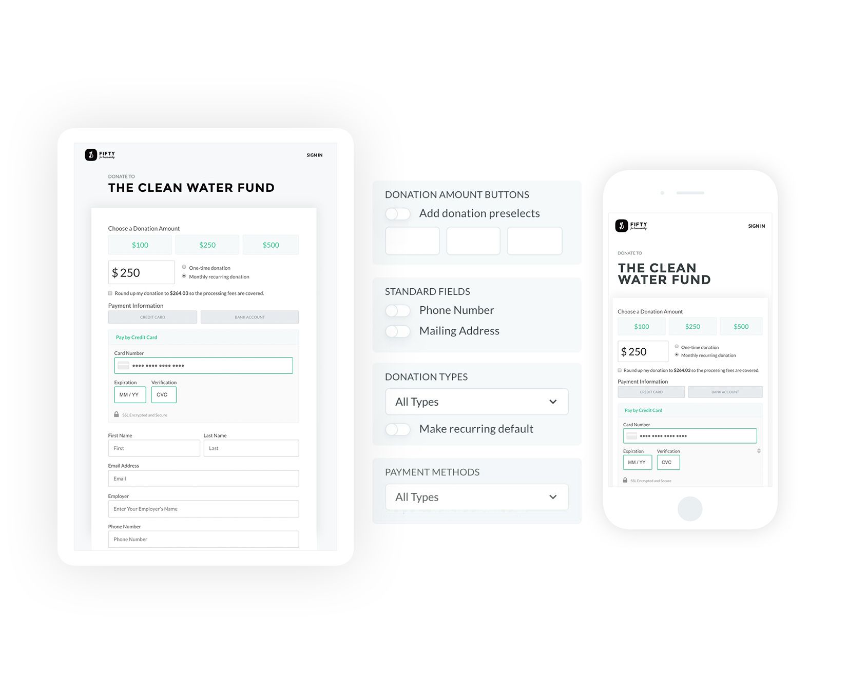
One of our most requested features is one of the biggest updates we made in this version. You can now have multiple versions of your donation form on Donately, each saved right to your dashboard. This also means that your hosted Campaign pages can each have a unique form, allowing you to collect the exact information you need from the right donor at the right time. What’s more, being able to assess the impact of different forms right from the dashboard should help you optimize your online fundraising.
New Campaign Page Builder & “Earmark Only” Option
The ability to create a Campaign without a goal was another highly requested improvement that was incorporated into this release. This is especially useful for those who embed their donation form on their site but need the organization that is provided with Campaign earmarking.
When you do create a full Campaign page, you’ll also notice a more refined text editor, as well as an improved image uploader. These two improvements should provide you more options to create a beautiful page that helps drive more donations for your organization.
Mobile Optimized
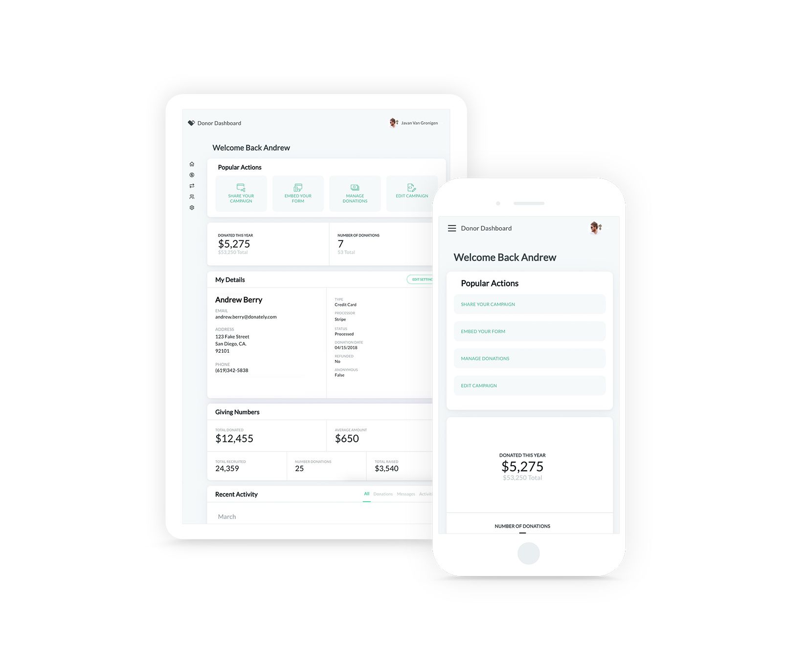
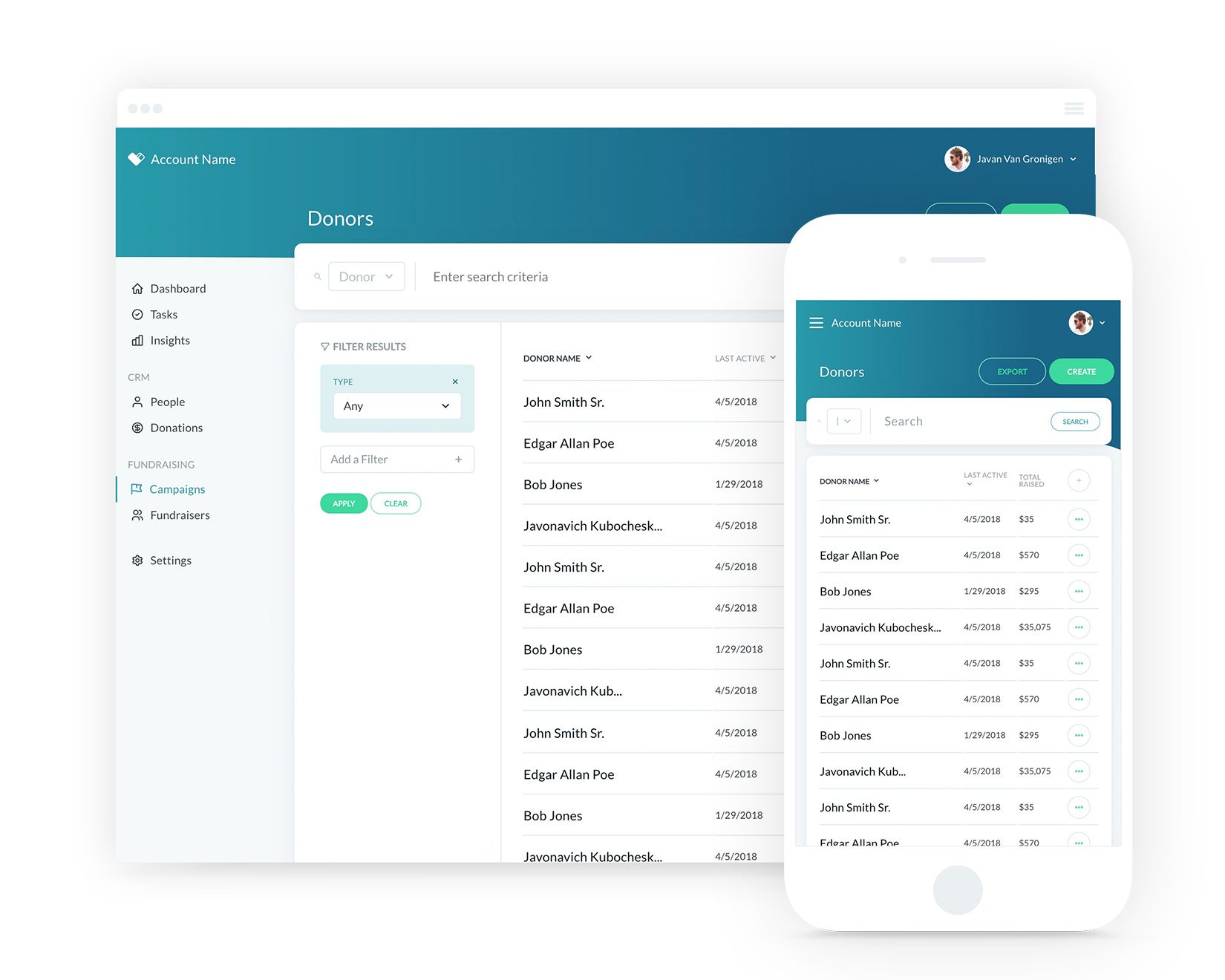
If you’re always on the go, you’ll appreciate that our dashboard is now optimized for any mobile device. Though you cannot do some things on mobile phones yet, such as build a new donation form or Campaign page, you will be able to view and manage donors, donations, recurring plans and much more.
Improved Speed & Navigation
With this redesign, we have simplified how you navigate between pages. Additionally, the entire dashboard was built from the ground-up, which has greatly improved the speed and reliability of the dashboard. Our goal from these two improvements is to provide users an intuitive experience that speeds up their everyday tasks.
Robust Overview Pages
Our overview pages have a whole bevy of improved features. On these pages, you’ll see a cleaner filter structure, a better search bar, and the ability to add or remove columns. Additionally, you’ll notice a few “quick” actions next to every line on overview pages, which should save you time whenever you have to manage an individual aspect, such as a donor, donation or Campaign page
Enhanced Login Security
We made a substantial upgrade to our log in process by partnering with Auth0. This partnership will offer users next-generation protection for your account. You can continue to log in as you always have, you’ll just now have an added layer of security!


